Programming the Register Interface
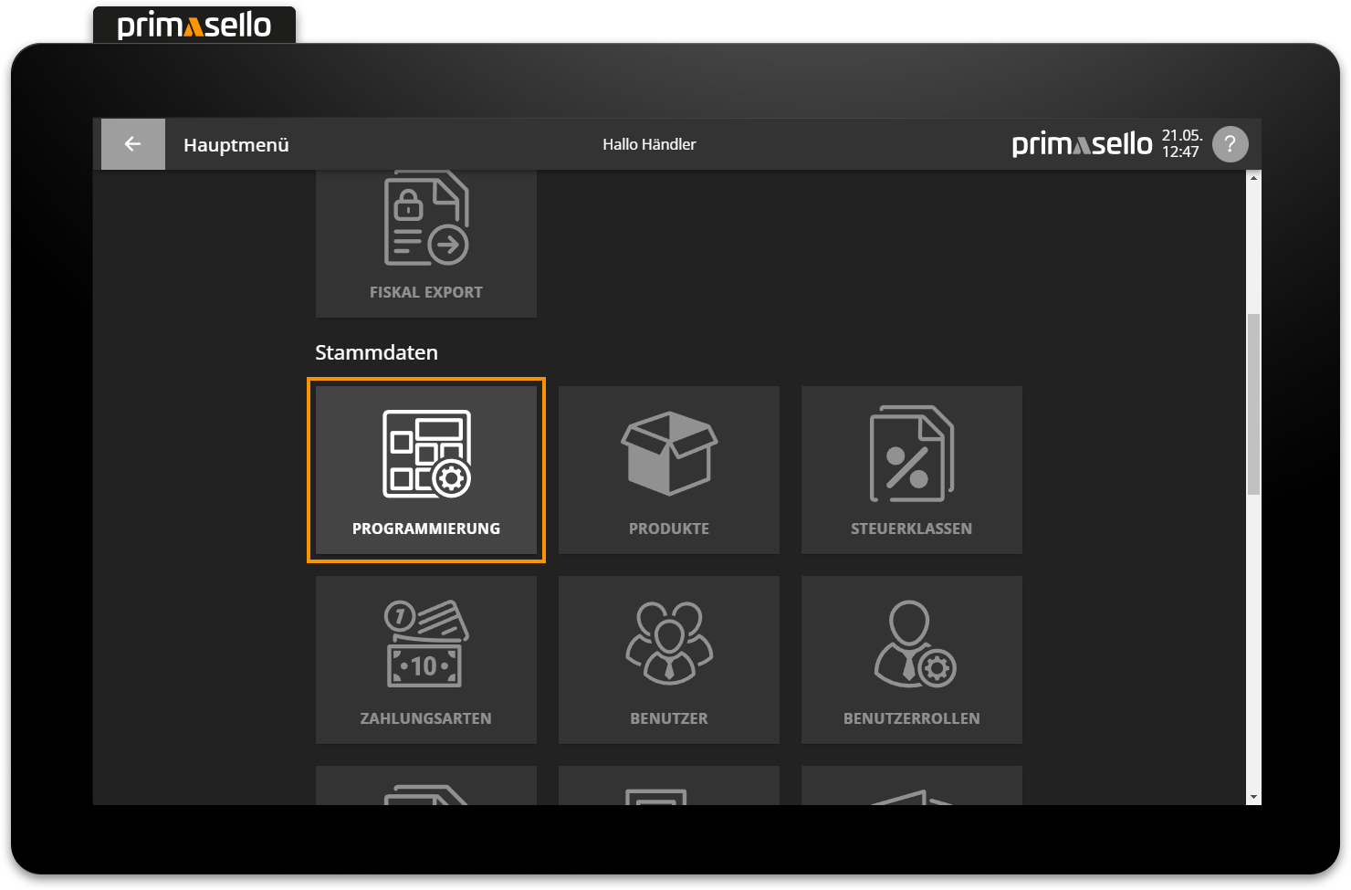
This chapter describes how to program the register interface. By customising the register interface, the primasello cash register can be perfectly adapted to the needs of any industry and any company. Editing can be started in the main menu in the ‘Master data’ section via the ‘layout editor’ button.
Preparation
It only makes sense to edit the interface once all the necessary master data has been created and settings have been configured. If not all products or payment methods have been created, it can be tedious to switch back and forth between configurations.
General information for orientation
The editing bar is located at the top of the programming interface. The function grid is located below the editing bar. All function buttons for the register interface are placed on this grid. The grid is displayed in the same ratio as it will later be seen on the register interface.
The navigation bar is located on the right-hand side and displays the different levels of the programming interface.
Editing bar
The editing bar displays various quick settings menus for the function buttons. If no function button is selected, general settings for the register interface can be made.
The function button which is currently being edited is displayed at the far left of the editing bar.
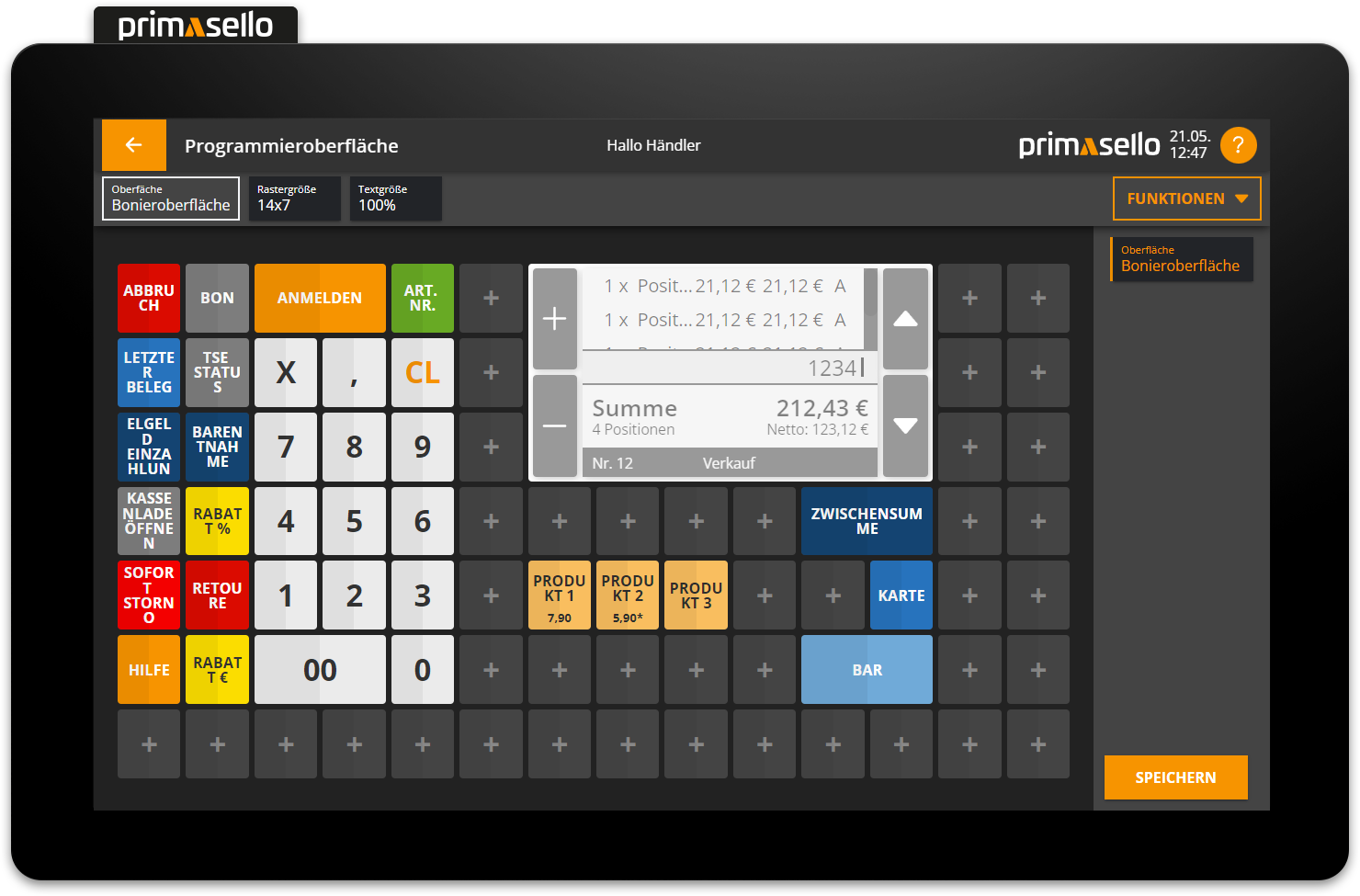
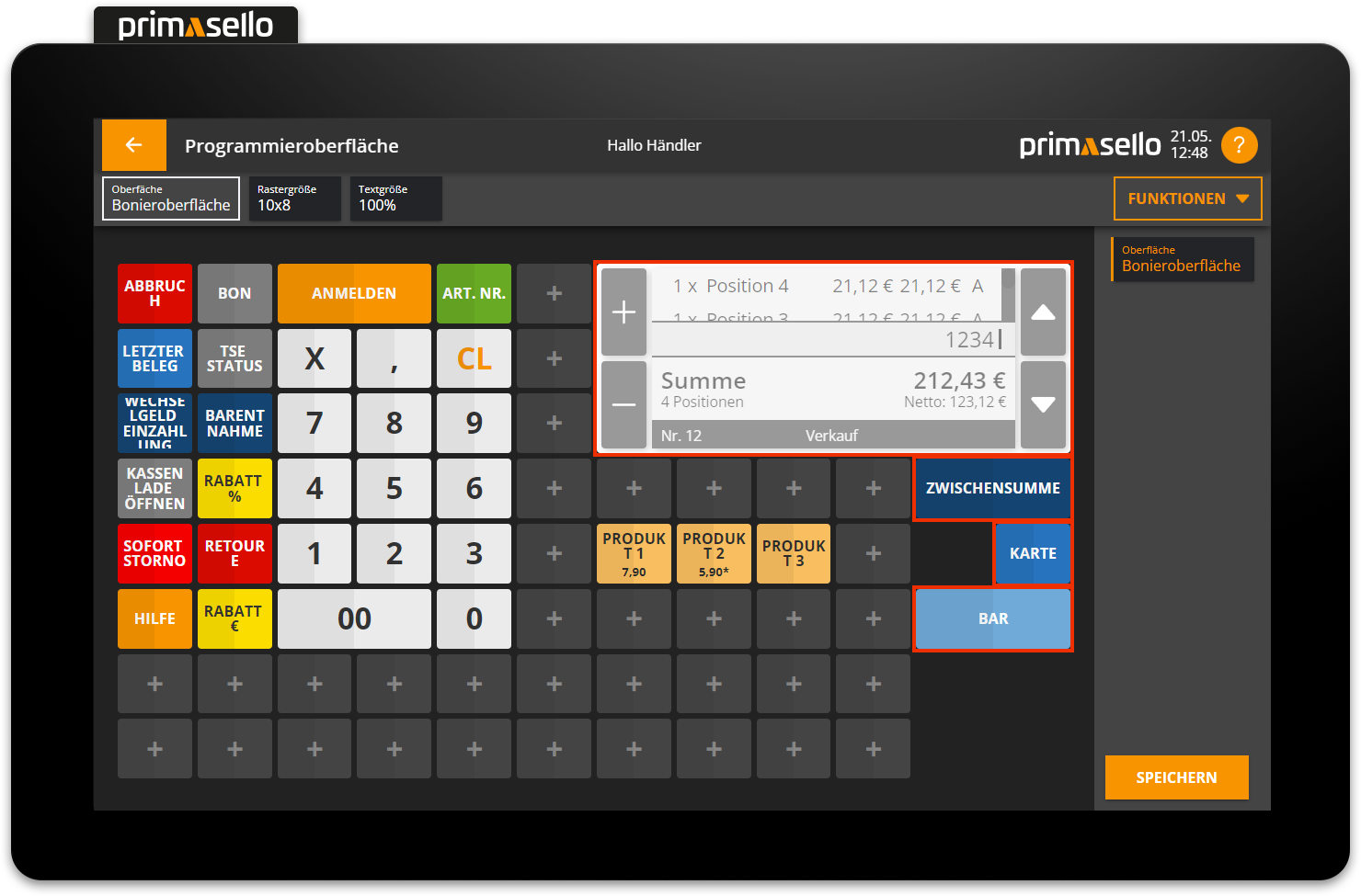
Change grid size
The size of the grid on the programming interface can be changed by pressing the ‘Change grid size’ button.
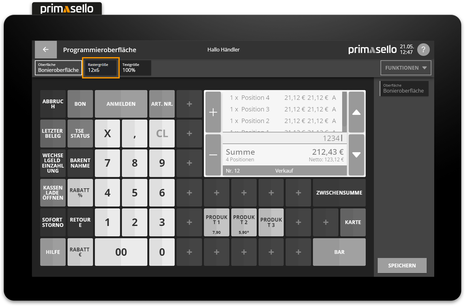
A new window will open with a selection of different grid sizes. At the end of the list, you can select ‘Custom’ to define your own grid size.

The first number indicates the number of available buttons in width (from left to right) and the second number indicates the number of buttons in height (from top to bottom). Depending on the total number of buttons required, the desired grid size can be selected here. Pressing the orange ‘Apply’ button applies the new grid size to the programming interface. Pressing the ‘Cancel’ button discards the change and the grid remains unchanged.
Buttons outside the grid
If the grid size is changed (e.g. reduced), function buttons that have already been placed may no longer fit on the grid. These are then displayed in the same position as before, but with a red border. The function buttons can be dragged onto the new grid and the red border will disappear.
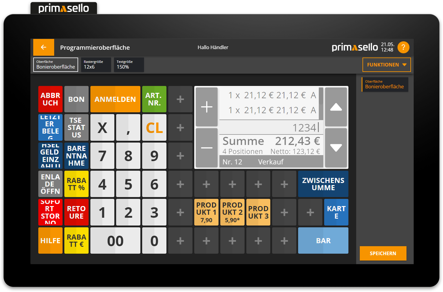
Change text size
By pressing the ‘Change text size’ button, you can change the size of the text displayed on the register interface.
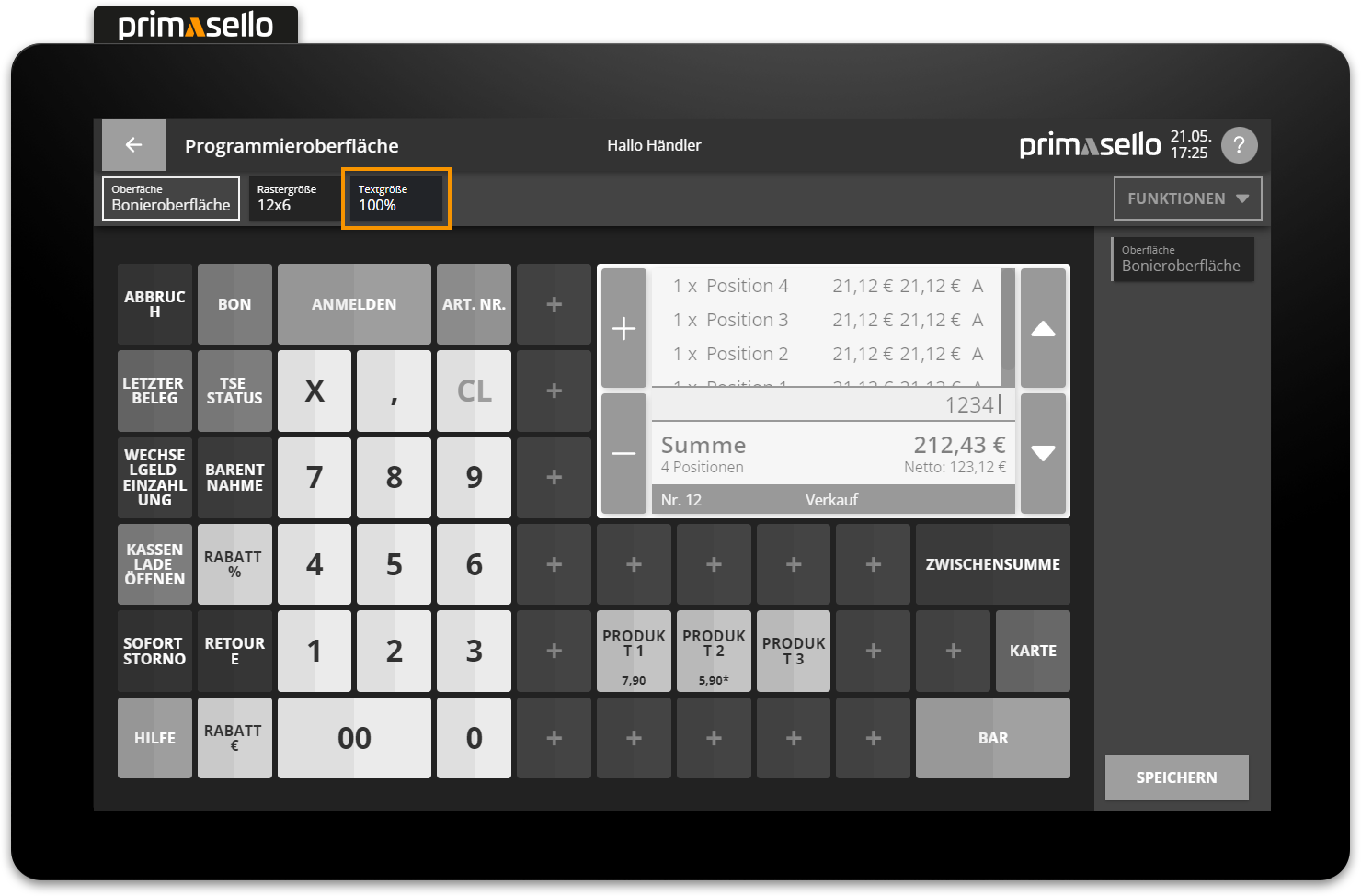
A new window will open with different percentages that increase or decrease the text size by the respective selection. At the end of the list, you can select ‘Custom’ to define your own text size in percent.
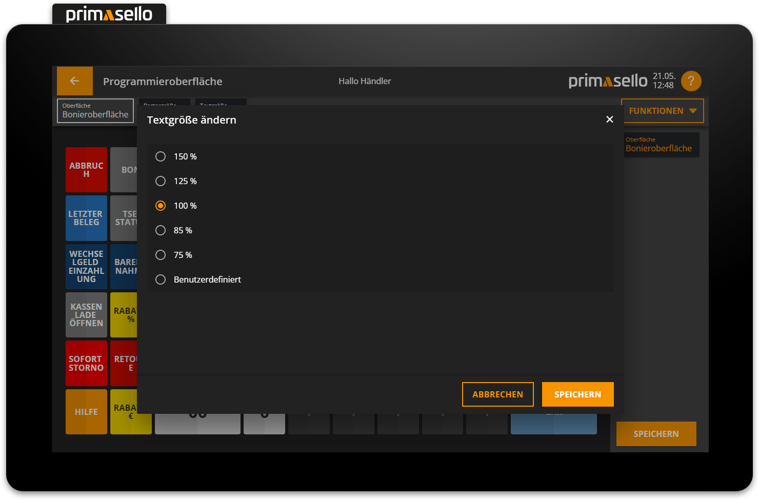

Pressing the orange ‘Apply’ button applies the new text size to the programming interface. Pressing the ‘Cancel’ button discards the change and the text size remains unchanged.
Tip
When changing the text size, it should always be checked on the register interface as well, as the two display sizes may differ slightly from one another.
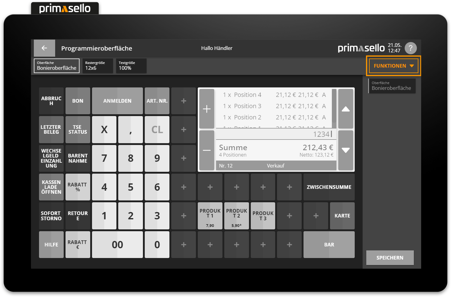
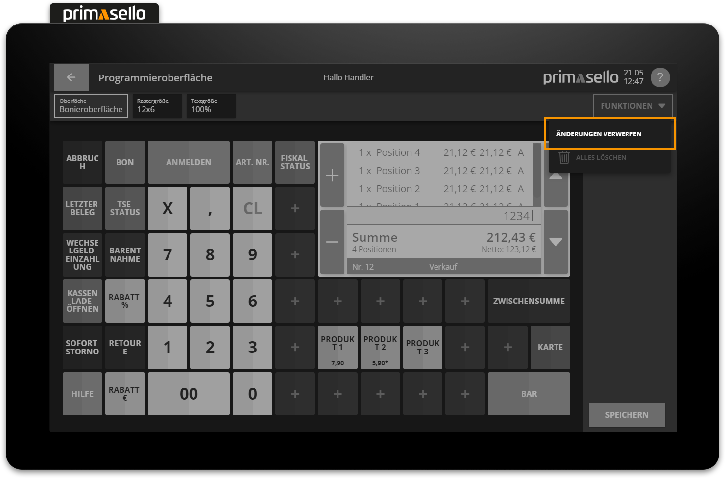
Function button
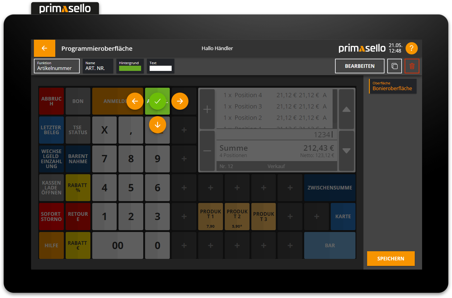
The ‘Functions’ button is located at the top right of the editing bar. It contains two menu items for discarding changes to the programming interface.
Discard changes
Pressing the ‘Functions’ button opens a submenu. Pressing the ‘Discard changes’ button deletes all changes to the layout editor that have been made since the last save.
Before the changes are deleted, a security prompt opens, which can be confirmed with the ‘Yes’ button to delete the changes, or cancelled with the ‘No’ button to keep the changes.
Delete everything
Pressing the ‘Functions’ button on the base layer opens a submenu. Pressing the ‘Delete all’ button deletes all function buttons on the programming interface. This function can be helpful when starting a new programming session.
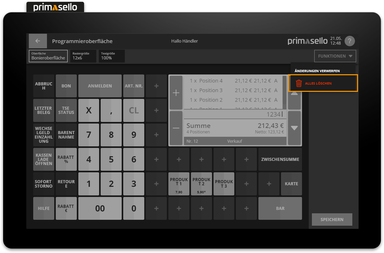
Before deleting all buttons, a security prompt opens. The process can be confirmed with the ‘Yes’ button or cancelled with the ‘No’ button in order not to delete the programming interface and continue editing.
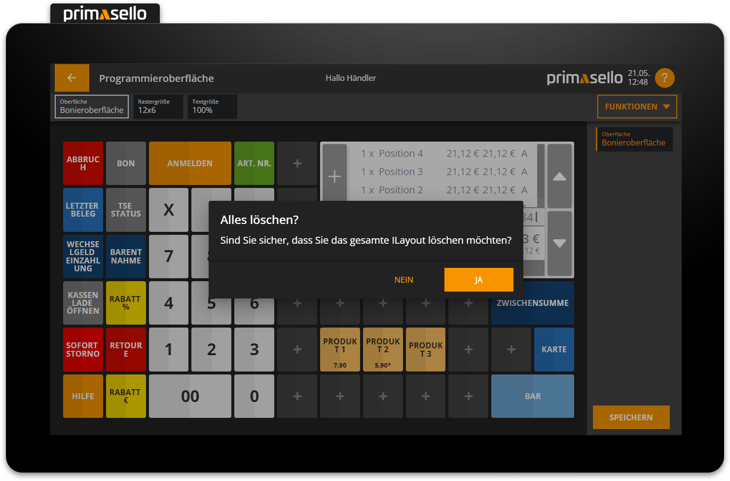
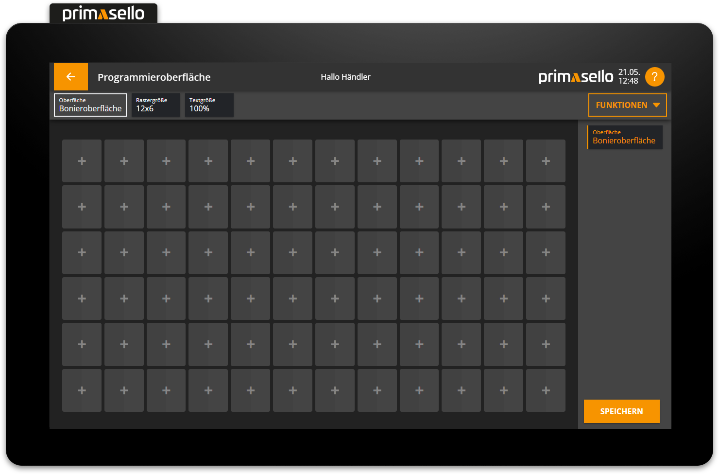
If the query is confirmed and the programming interface is deleted, all function buttons are removed and an empty grid is displayed.
Navigation bar
The navigation bar is located on the right-hand side. It shows where you are currently located on the programming interface. Each section of the interface has its own field in the navigation bar. The section you are currently in is highlighted in orange. The sub-area is named in the top line of each of these fields, and the name of the sub-area is located below it. Pressing one of the fields takes you to the editing screen for the respective area. If an error occurs in one of the areas, it is highlighted in red (e.g. missing function buttons).
Layer
The navigation bar is important when using layer areas or windows. It can be used to easily switch back and forth between the different levels.
Save programming
At the bottom right of the navigation bar is the orange ‘Save’ button, which can be used to save the programming of the register interface at any time. This transfers all settings to the register interface. If changes are made to the programming, an asterisk appears next to the page title in the status bar – ‘Programming interface*’ – indicating that the programming should be saved before exiting.
If you press the ‘Back’ button in the upper left corner of the status bar to return to the main menu without saving the changes, a security prompt will open. You can continue the process by pressing the ‘Exit’ button or cancel it by pressing the ‘Cancel’ button to save the programming after all.
Functions on the grid
Each function of the primasello cash register can be freely placed on the grid as a separate button. An overview of all available functions can be found in the chapter Overview of Function Buttons.
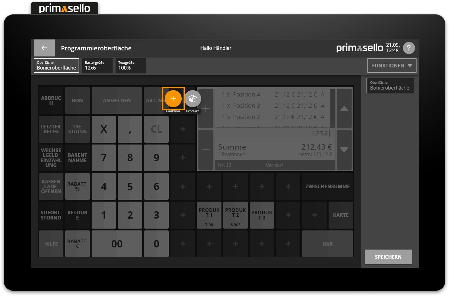
Add function button
Functions can be added to any free space on the grid. Free spaces are indicated by a ‘+’ symbol in the centre. To add a new function, click on the desired free space.
Two symbol buttons appear in the button menu above the pressed area: ‘Function’ or “Product”. How to add products is described below. Pressing the ‘Function’ button opens a window with a list of all available functions.
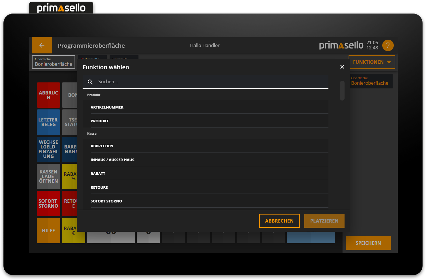
When you click on the desired function, it will be highlighted in orange and a brief description will appear below the function title.
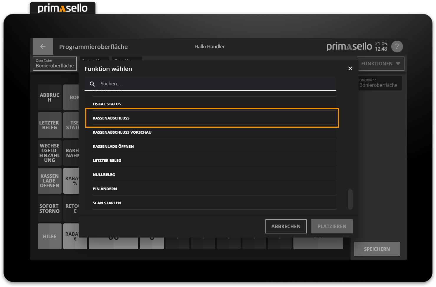
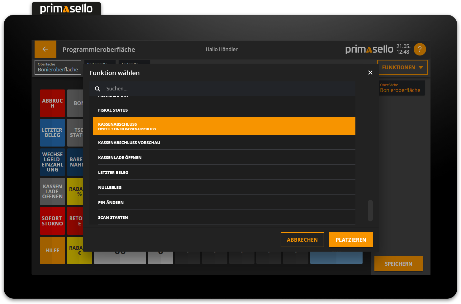
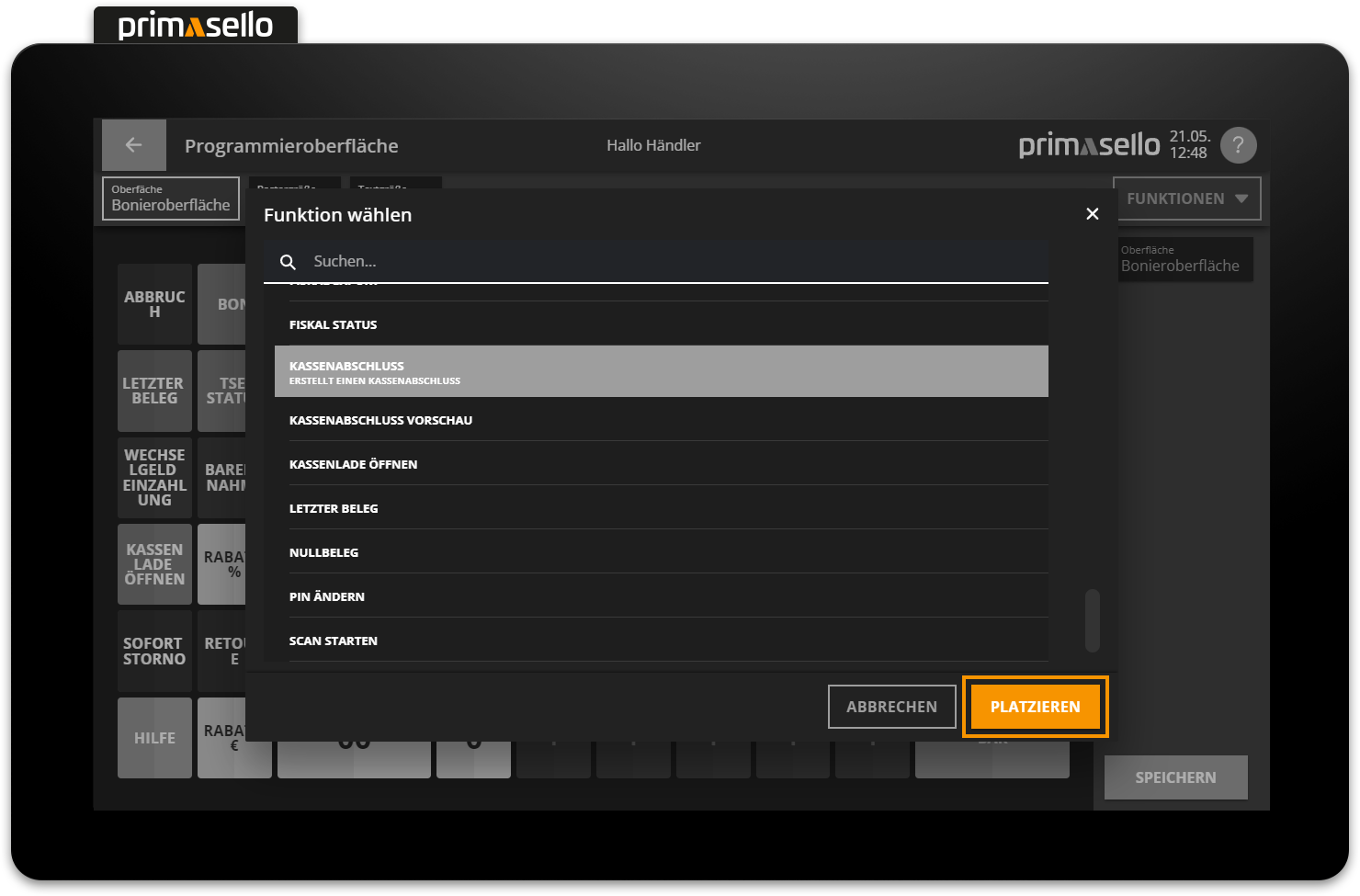
Pressing the orange ‘Place’ button in the lower right corner places the function as a button on the grid and closes the function window. Placing a function can be cancelled by pressing the 'Cancel' button or by pressing the ‘x’ button in the upper right corner.
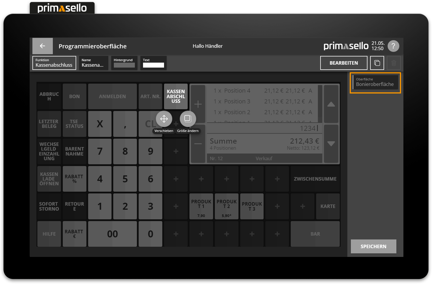
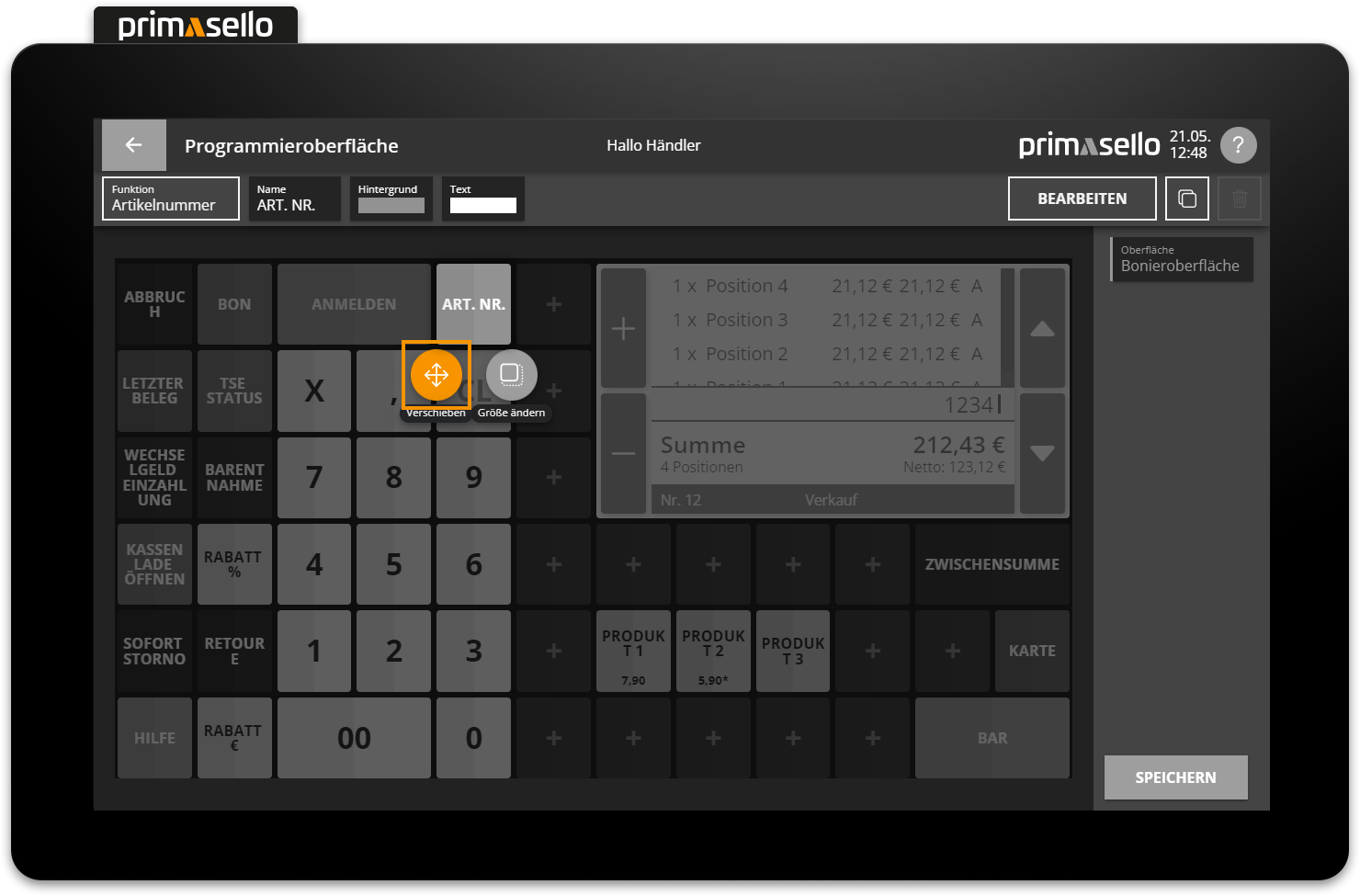
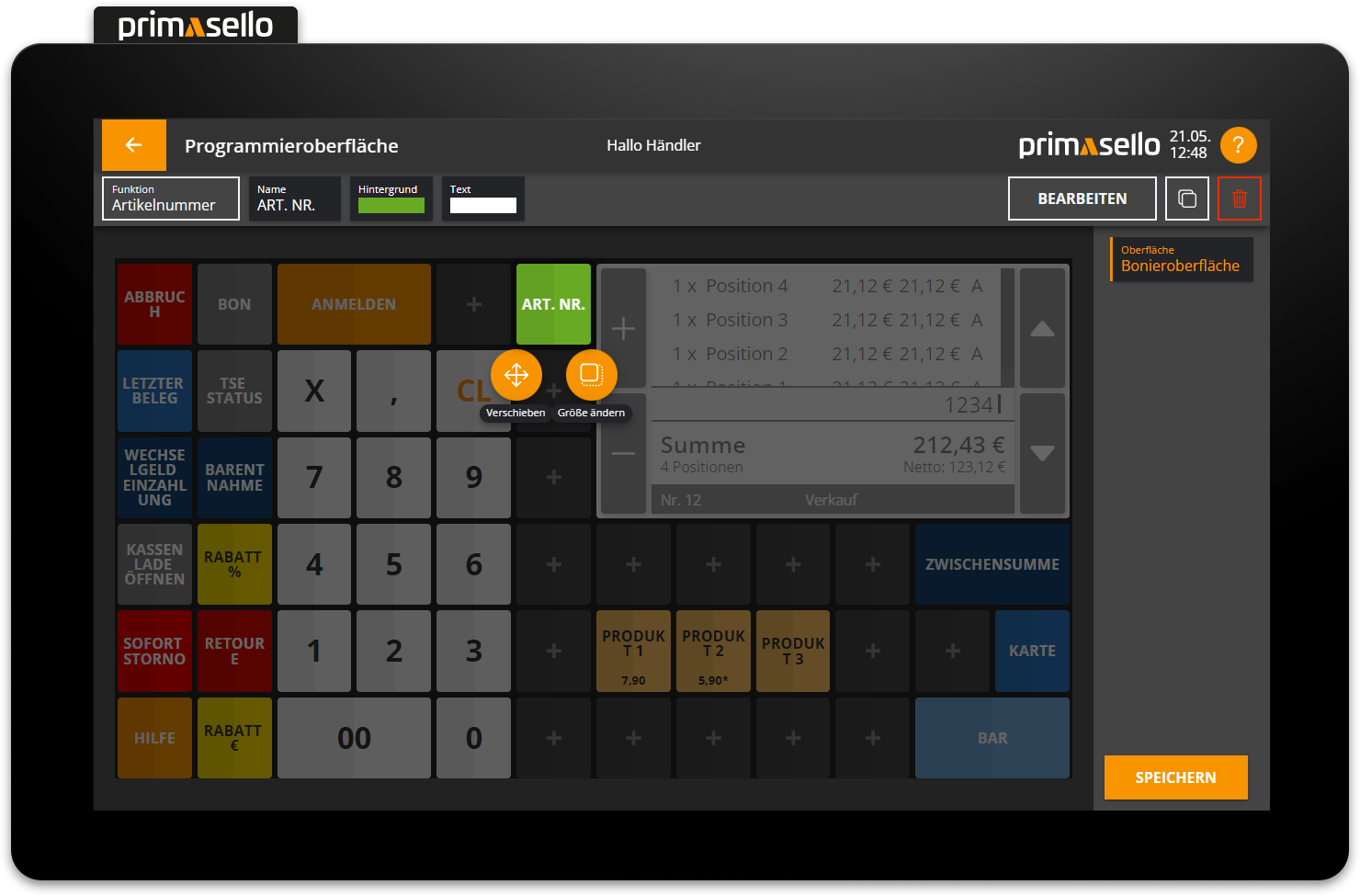
When a new function is added to the grid, a new button menu appears above or below the placed function button with the options ‘Move’ or ‘Resize’.
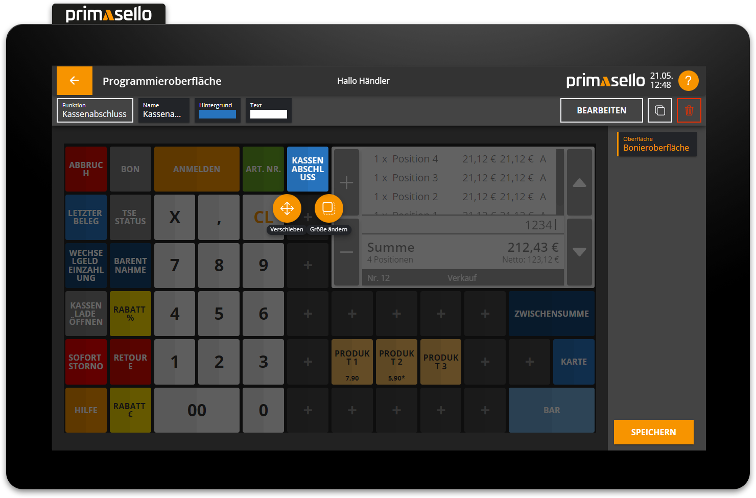
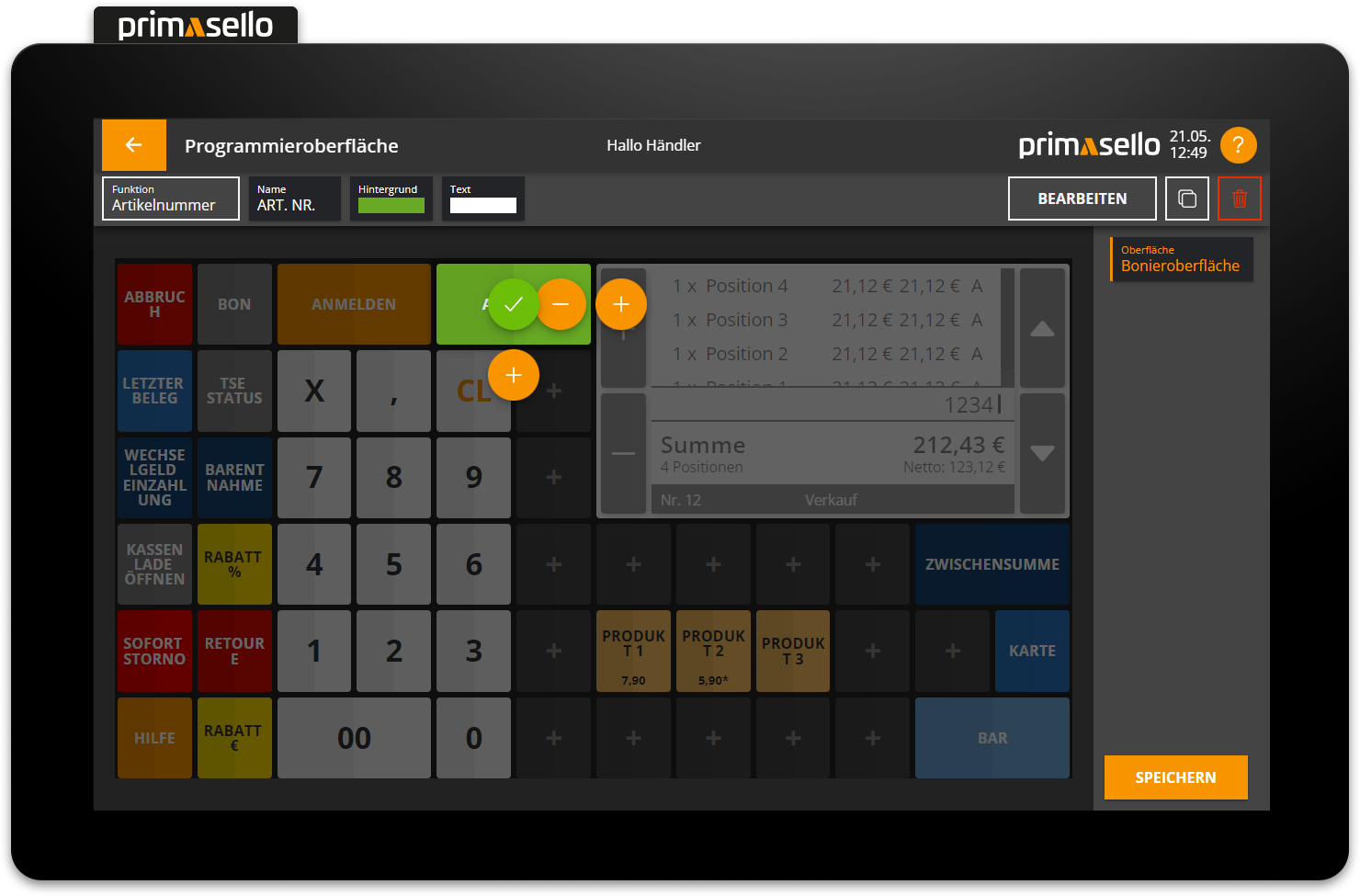
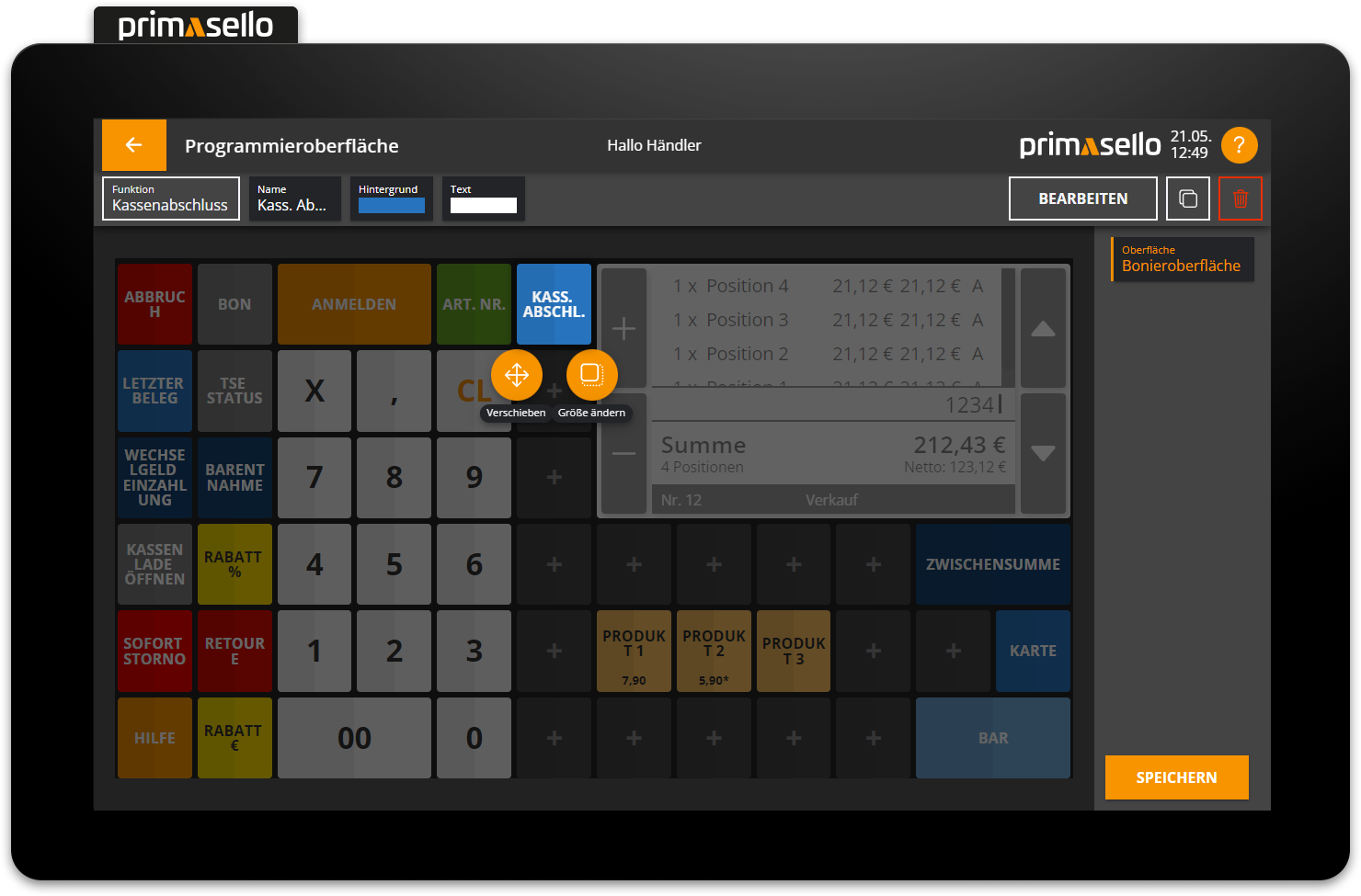
Move button
To move a function button, it has to be selected.
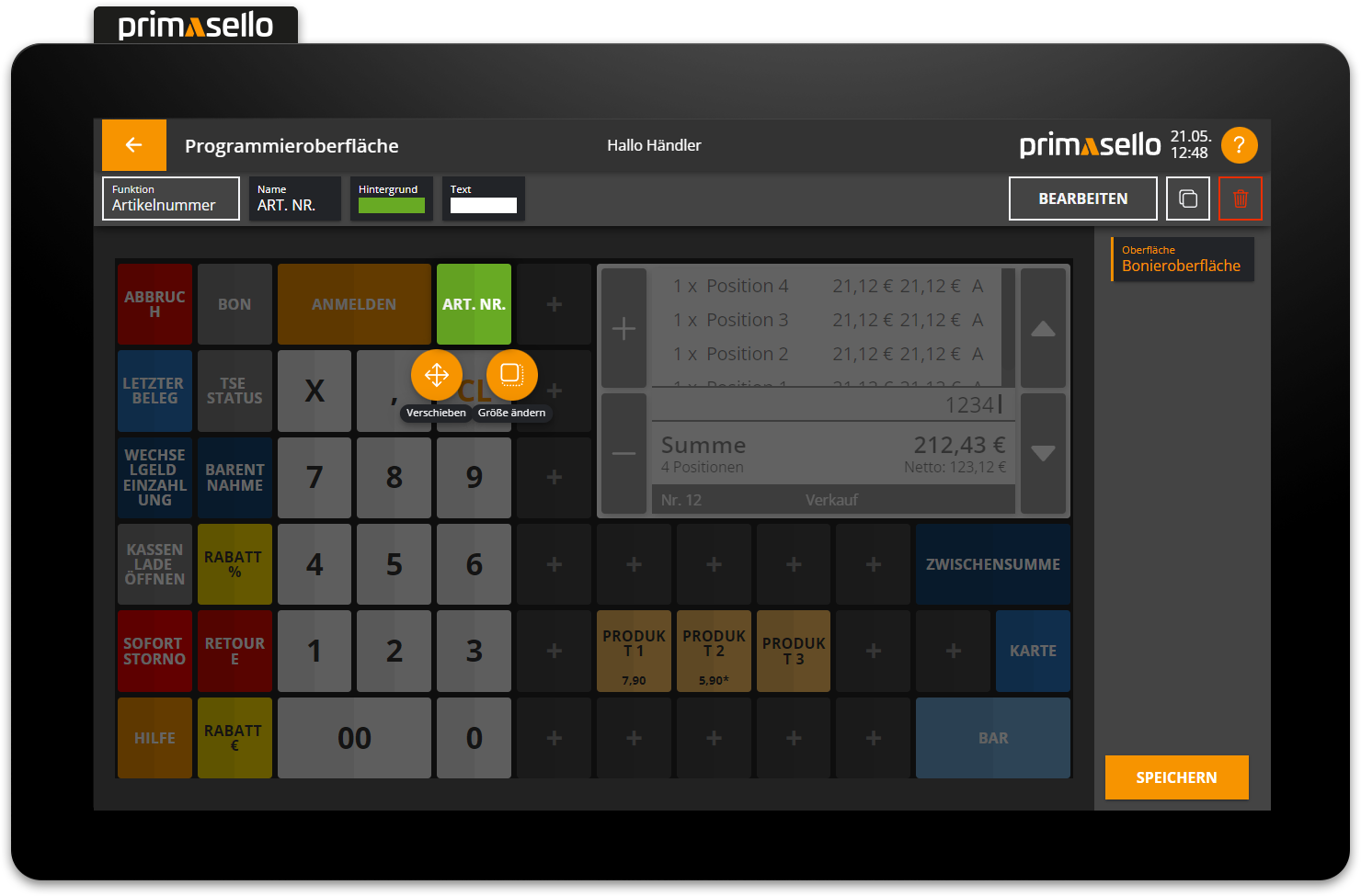
In the button menu that appears around the function button, you can press the ‘Move’ button.
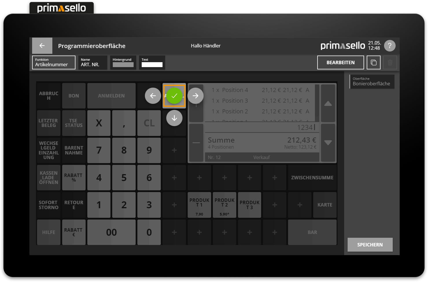
The ‘Move’ menu opens, displaying arrows around the button which, when pressed, move the button in the specified direction. If the function button is located at the edge of the grid, it cannot be moved beyond that point.
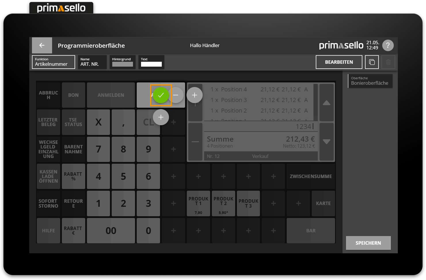
To confirm the relocation of the function button and exit the ‘Move’ menu, press the green tick icon in the centre of the key.
Drag & drop moving
Function buttons can also be moved by pressing and dragging them on the grid. However, this only works if the button has been selected but the 'Move' menu is not open.
Drag & Drop resizing
Function buttons can be enlarged and reduced in size using drag and drop via the small orange circle in the bottom right-hand corner.
Keyboard
The move mode can be started with the key combination [Ctrl] [M].
Buttons on top of each other
Keys can also be placed over other keys, which can cause problems. The key underneath will then no longer work. Therefore, function buttons should only be moved to free spaces.
Change button size
Each function button can be enlarged or reduced in size as desired on the grid. By default, all keys are placed in 1x1 fields.

To change the size of a function button, you have to first select it and then press the ‘Change size’ button in the button menu.
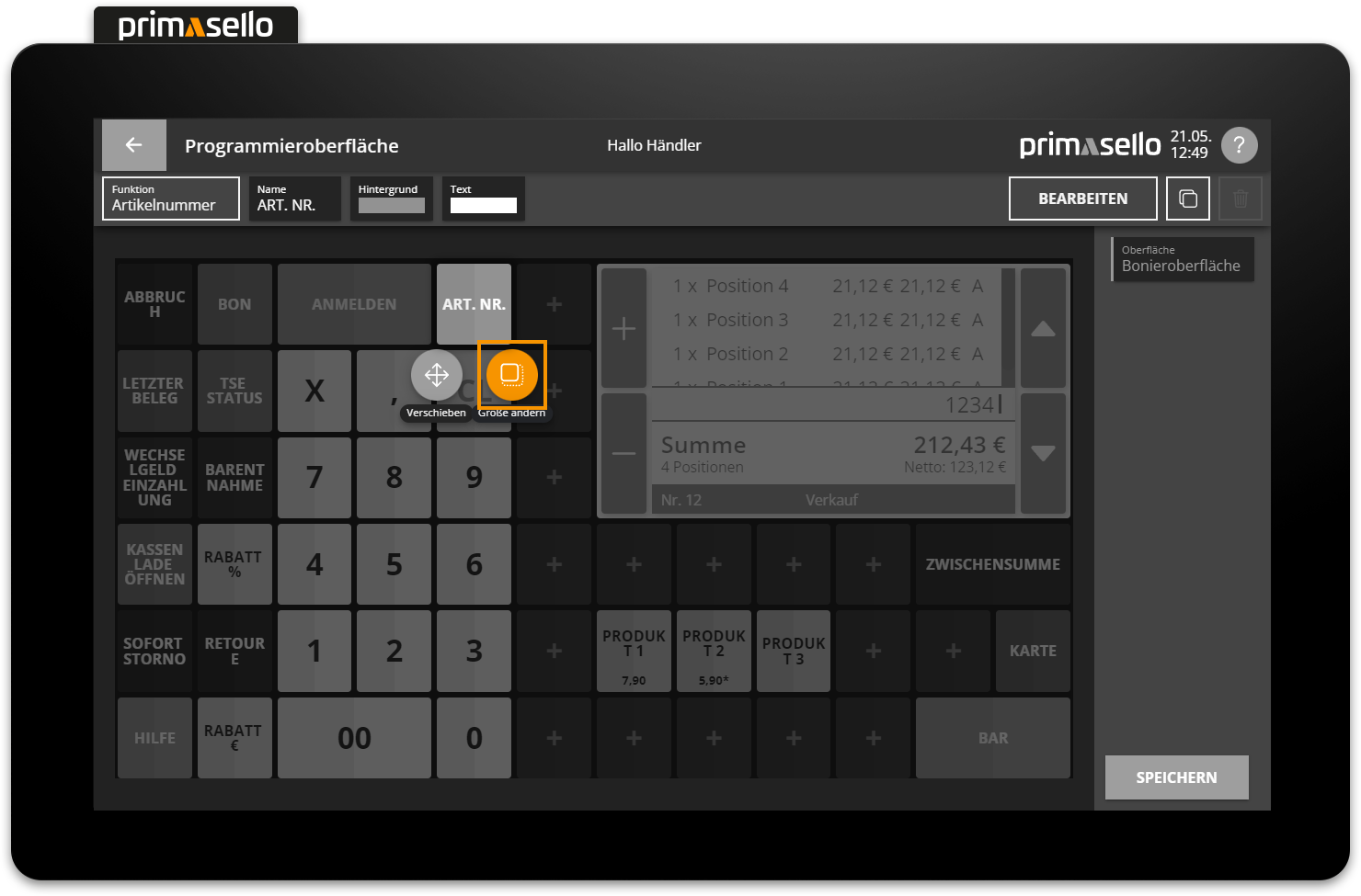
The ‘Resize’ menu opens and plus symbols appear next to the selected button, which can be used to enlarge the button. Function buttons can only be enlarged to the right or downwards – to the left or upwards, the button is reduced in size by pressing the minus symbols.
The button therefore has to be moved to the first and top field of the desired position before enlarging. The function button can be enlarged until it reaches the edge of the grid. A button can be reduced to its original size of 1x1 fields.
To confirm the size change of a function button and exit the 'Change size' menu, you have to press the green tick symbol in the centre of the button.
Keyboard
The size adjustment mode can be started with the key combination [Ctrl] [G].
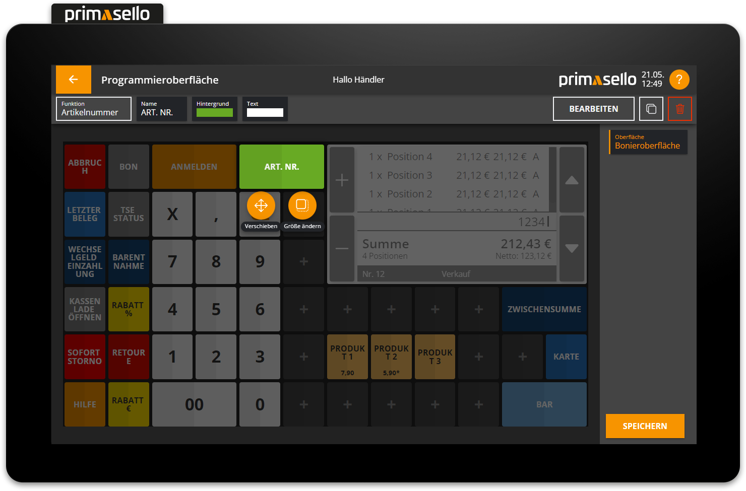
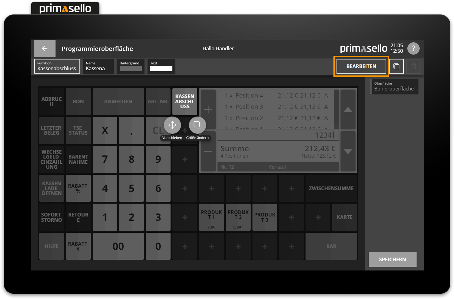
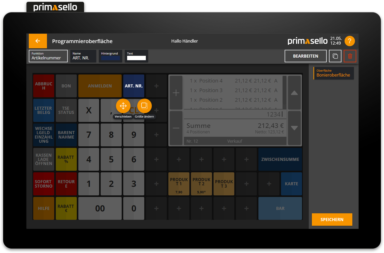
Edit button
Each function button has various settings (such as name and colour) that can be configured individually. All quick setting options are displayed at the top of the editing bar. Pressing them opens a new window where the respective setting can be made. On the far right is the ‘Edit’ button, which opens a new window with all the setting options for the selected function button.
Keyboard
Editing can be started with the key combination [Ctrl] [E].
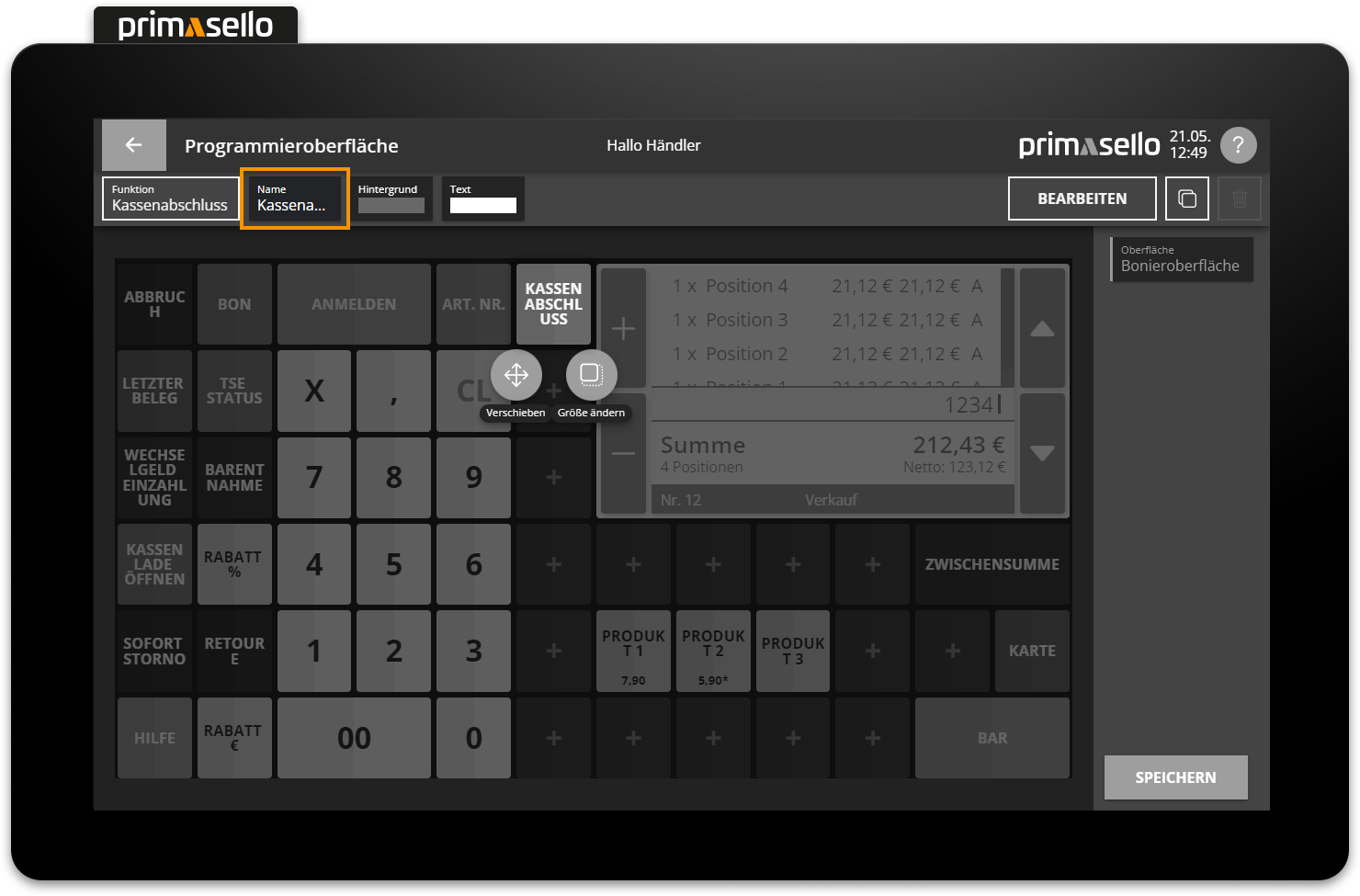
Name
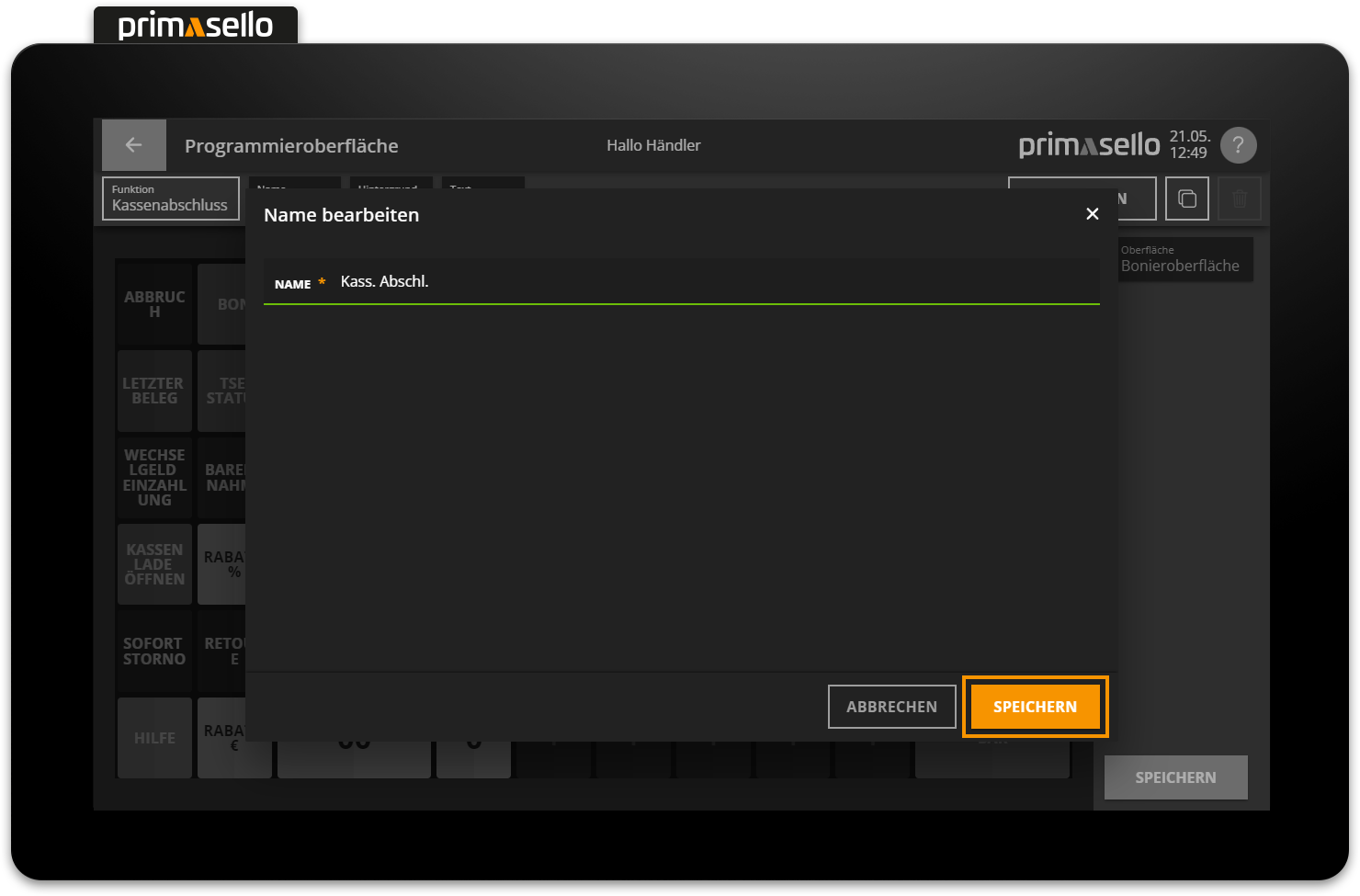
Each button can be given a name that is displayed in the register interface. By default, the product name is automatically pre-filled for products, the name of the payment method for payment buttons, and the name of the function for other functions. By clicking on the name field, the button can be given a new name.
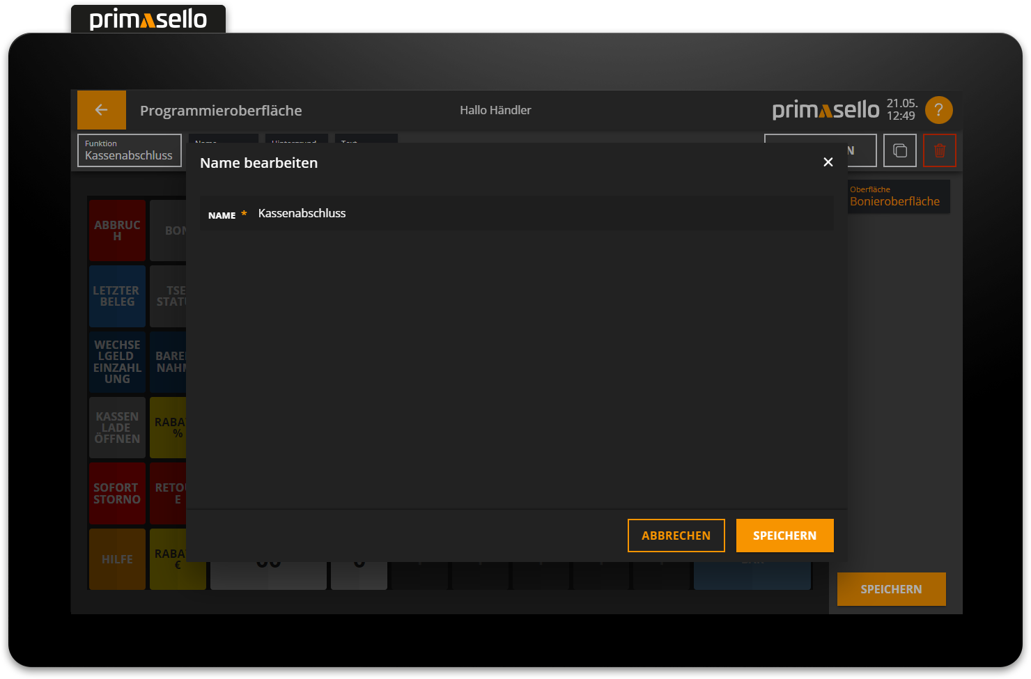
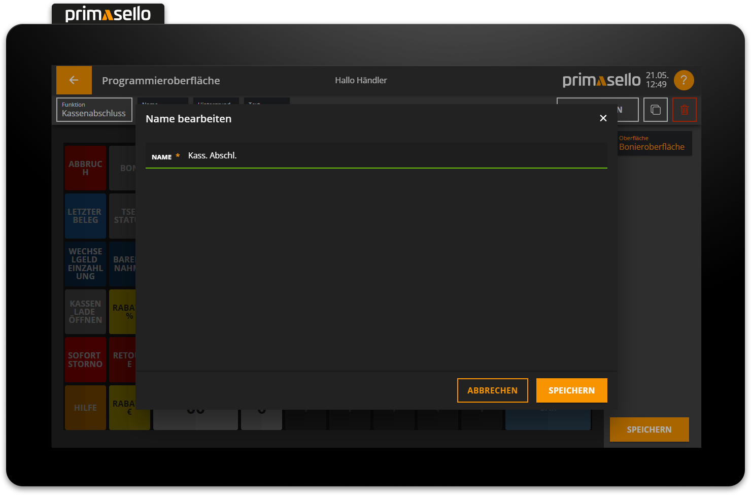
Pressing the orange ‘Save’ button in the lower right corner will save the name and close the window. You can cancel changing the name by pressing the “Cancel” button or the ‘x’ button in the upper right corner – all changes will be lost.
Tip
To split the name across several lines, a line break can be forced using the vertical bar symbol ‘|’.
Colour
Each function button has a background colour and a text colour that can be freely adjusted. The primasello cash register has default colours preset for all function buttons, which can be changed by pressing the corresponding colour field. Pressing the background or text colour field opens a new window with the colour selection.
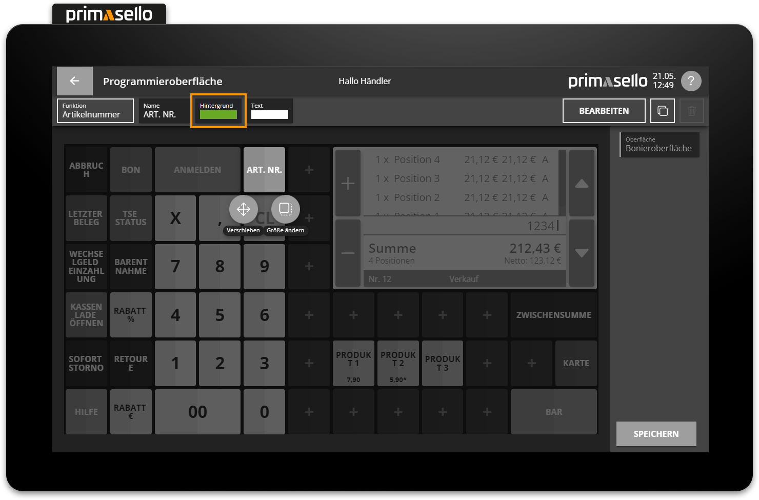
When a colour area is selected, the window closes and the colour is applied to the function button.
Parameters
Additional settings, such as the type, can be made for some function buttons. When adding a new function that has different types (e.g. discount with type ‘Discount in euros’ or type ‘Discount in percent’), the type is requested in a new window when adding. To change the type of a key, click on the corresponding settings field in the editing bar. The same window will open as when adding, with a selection of different types.
The following functions have a type selection:
Discount (choice between euro and percentage)
Product (selection of the product from the master data)
Keyboard (selection of the keyboard command)
Payment (selection of the payment method from the master data)
Table (enter a table number)
Log in (enter a user number)
If the type of a function button is changed, the name of the type is automatically adopted as the name for the key.
Alternative texts
Some function buttons change their appearance during operation (e.g. the ‘Return’ button changes to the “Sale” button). To edit this alternative text, press the ‘Alternative text’ field and enter a new text in the same way as for the name field.
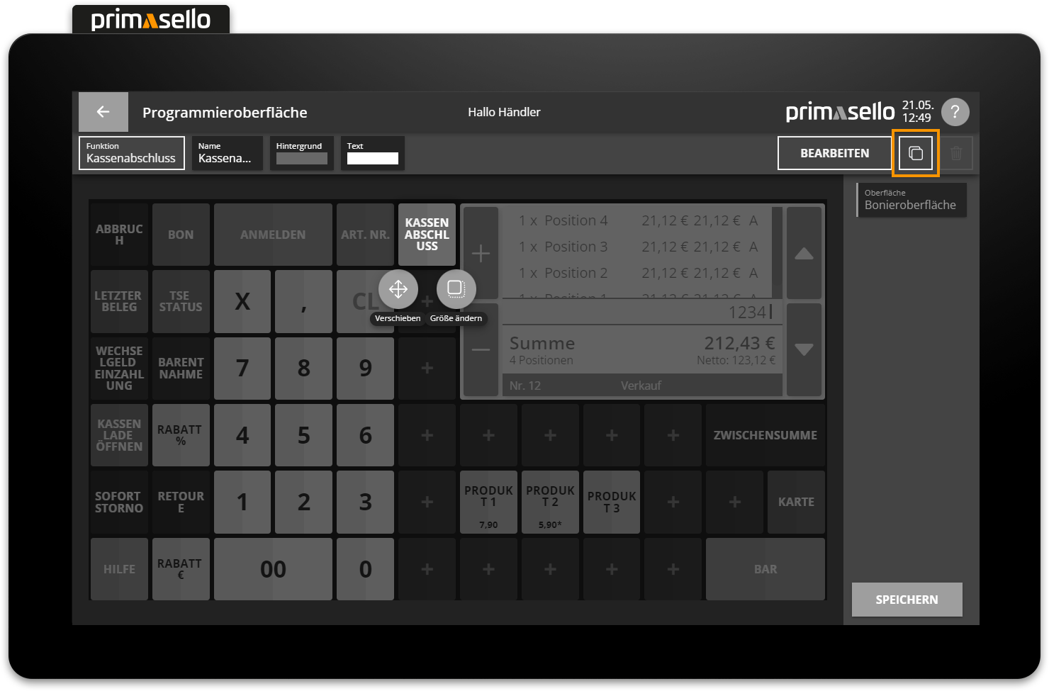
Copy button
The copy function can be used to copy a button on the programming interface. The button is then inserted at the same position as the existing button with the addition of ‘Copy’ in its name. The button can then be moved to another position and edited.
Keyboard
A button can be copied using the key combination [Ctrl] [D].
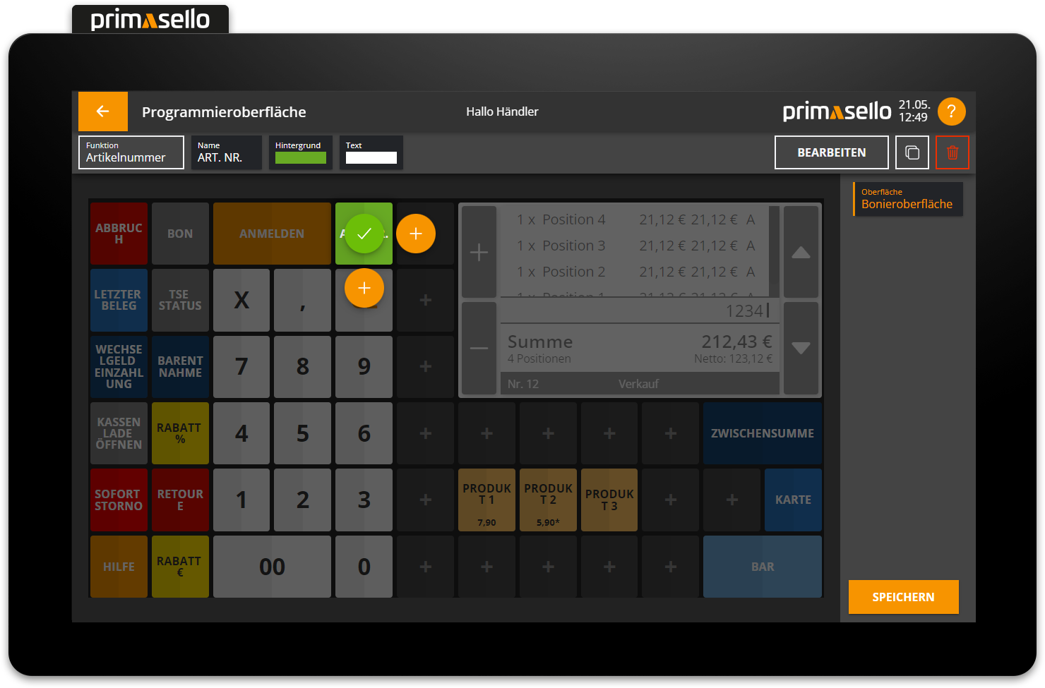
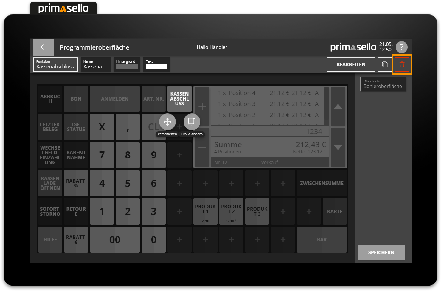
Delete button
To delete a function button from the programming interface, you have to first click on it. At the top right of the editing bar, you will find the red ‘Delete’ button with a bin icon. Pressing the ‘Delete’ button will delete the function button from the programming interface.
Keyboard
A key can be deleted using the key combination [Delete].