Add Products
Products can be placed on the surface in two ways: either via the product group element or individually. The product group element can be used to display all or selected products in a product group at the same time. Alternatively, products can also be placed individually on free fields.
Product group element
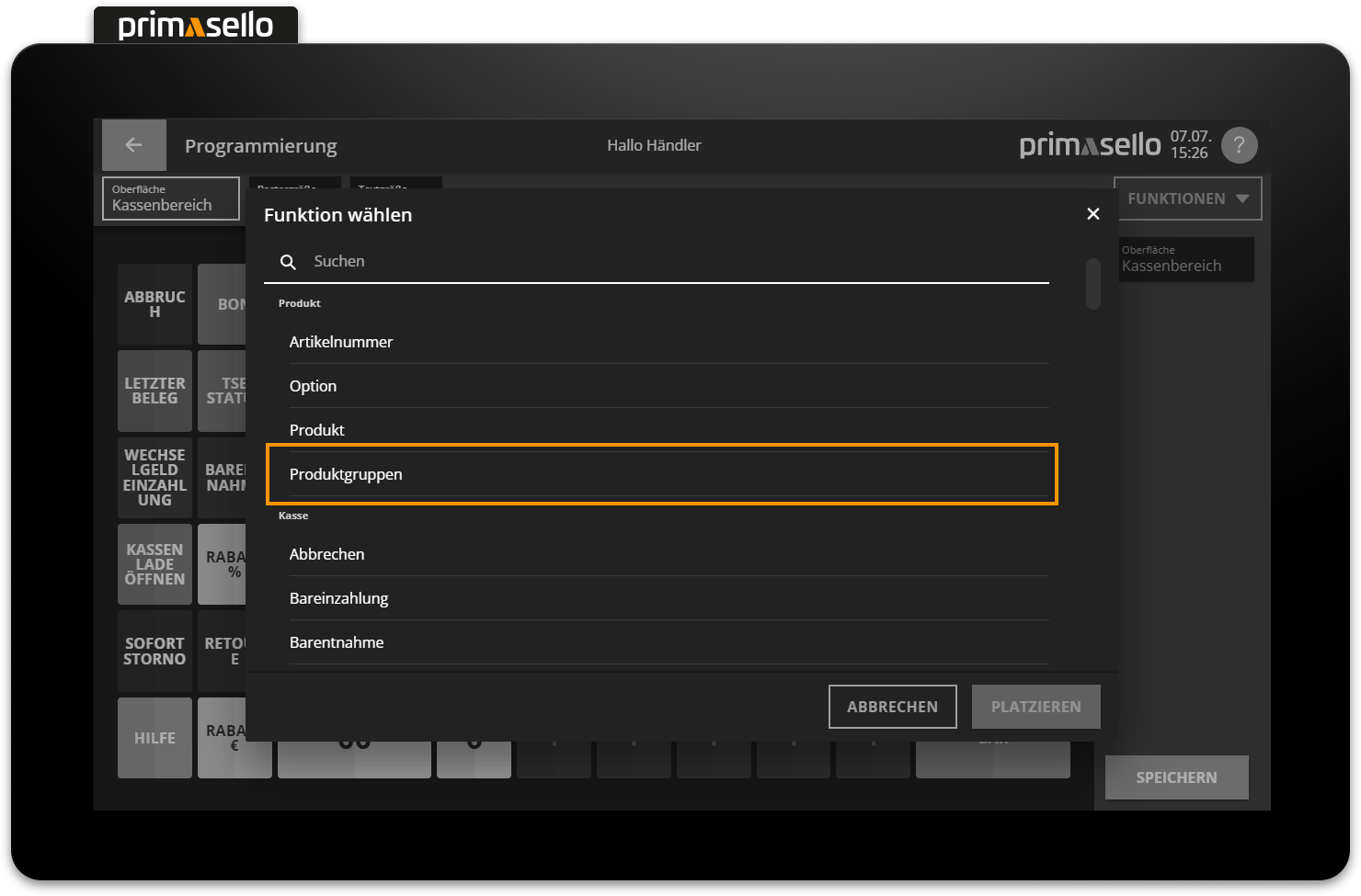
The product group element allows multiple products to be displayed on the interface. If there is not enough space to display all products at once, a browse function is automatically displayed. If there are multiple product groups in the system, you can switch between them. To use the element on the interface, you have to first select the ‘Product groups’ function.
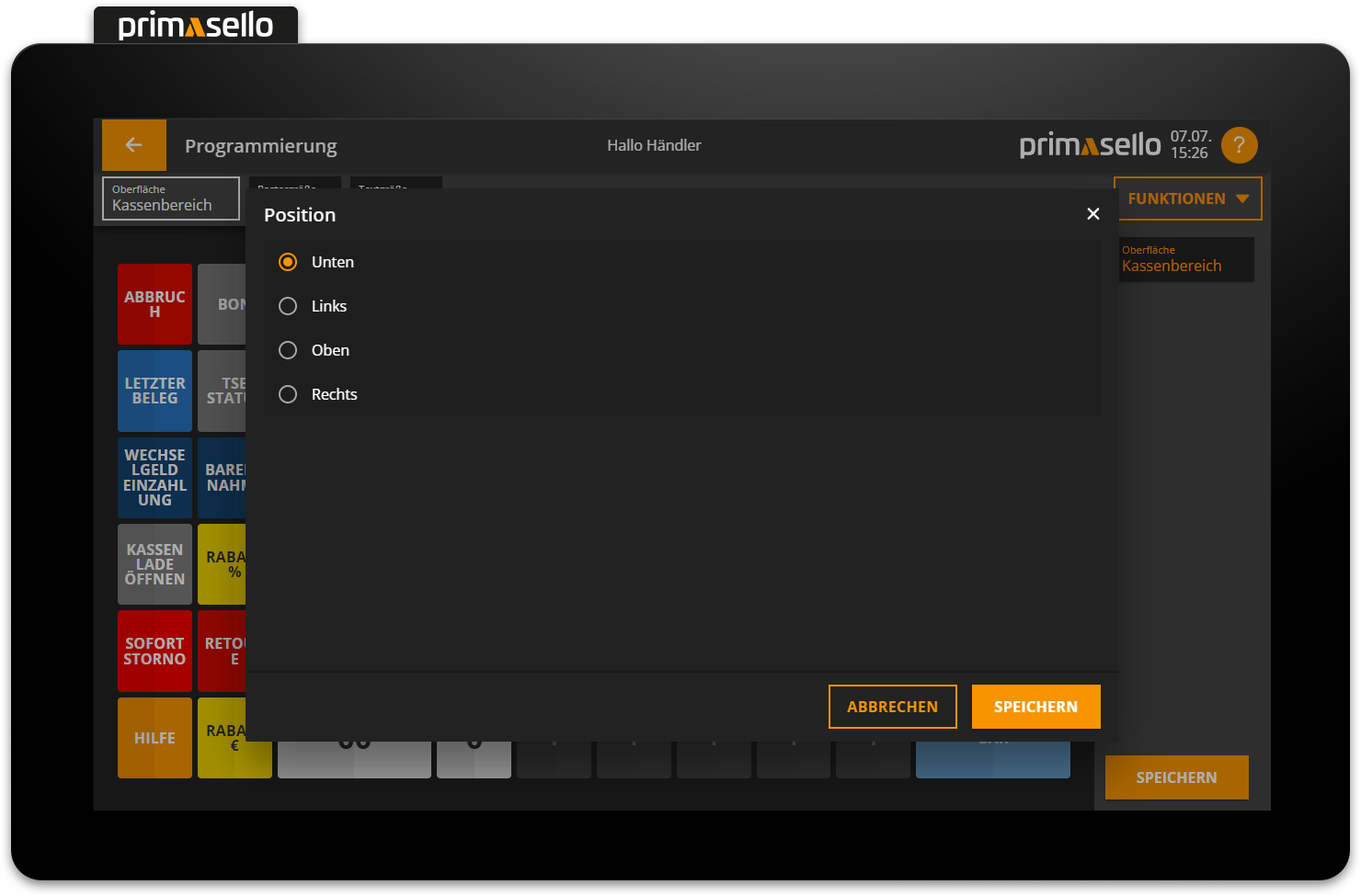
Next, you need to decide on which side the group buttons should be displayed – by default, they are displayed at the bottom.
Afterwards, the products stored in the system appear in the preview on the programming interface.
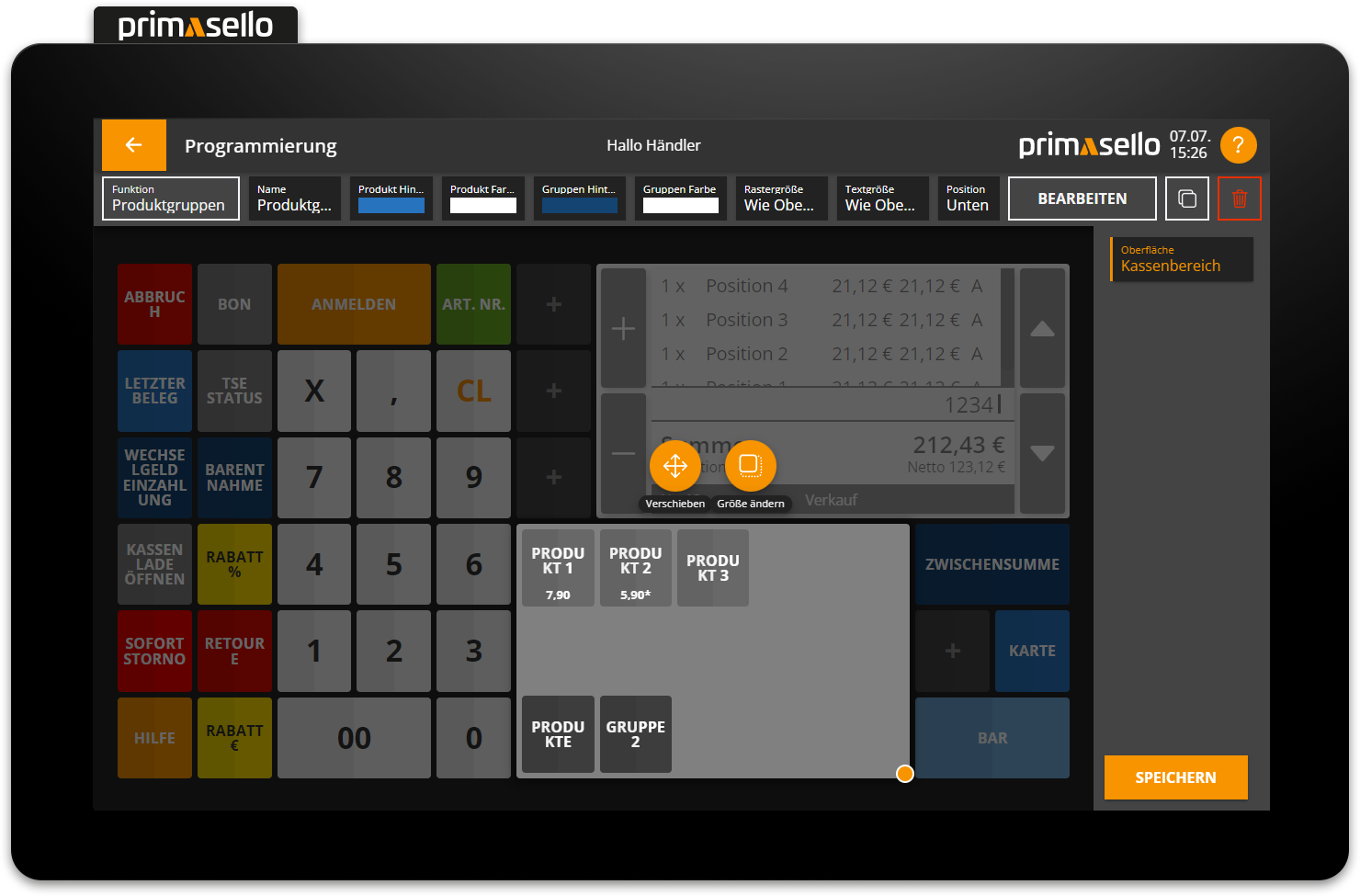
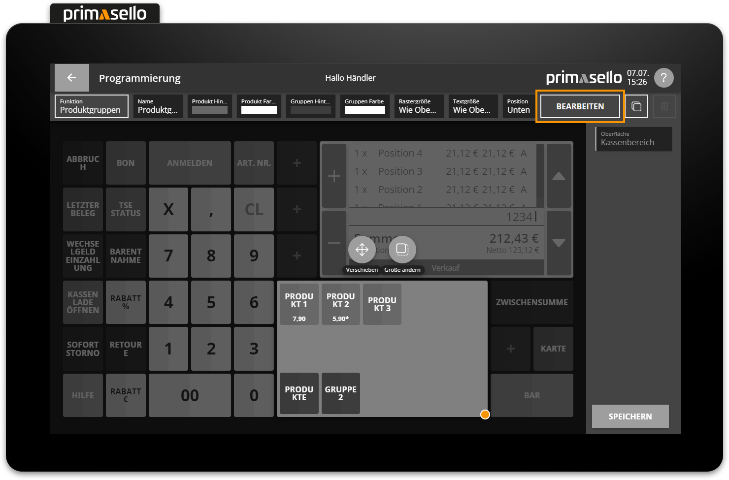
Further settings can be made using the edit function.
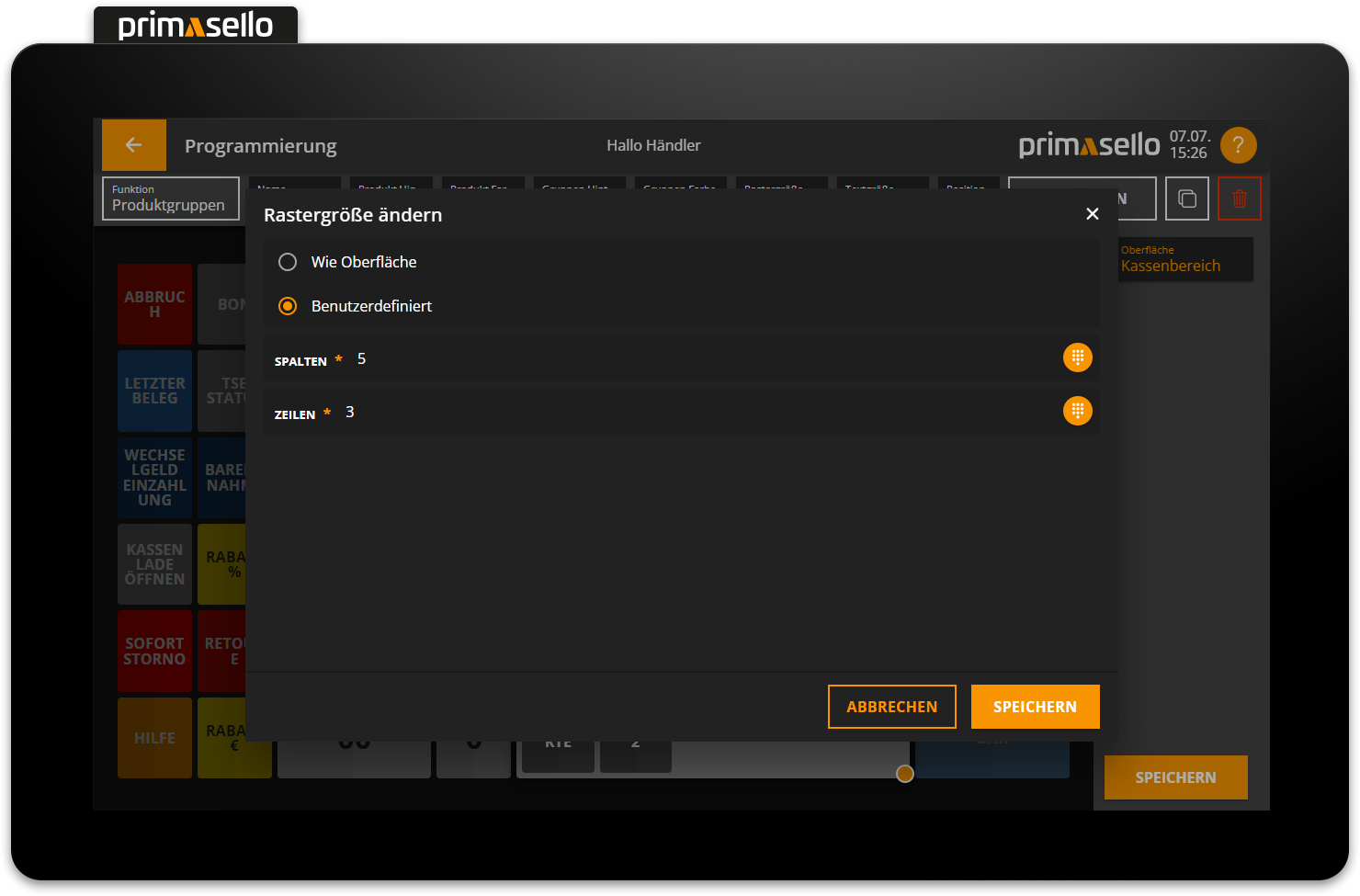
Grid size
The grid size determines how many products and groups are displayed simultaneously. By default, the grid size is taken from the layout, but it can be customised freely.
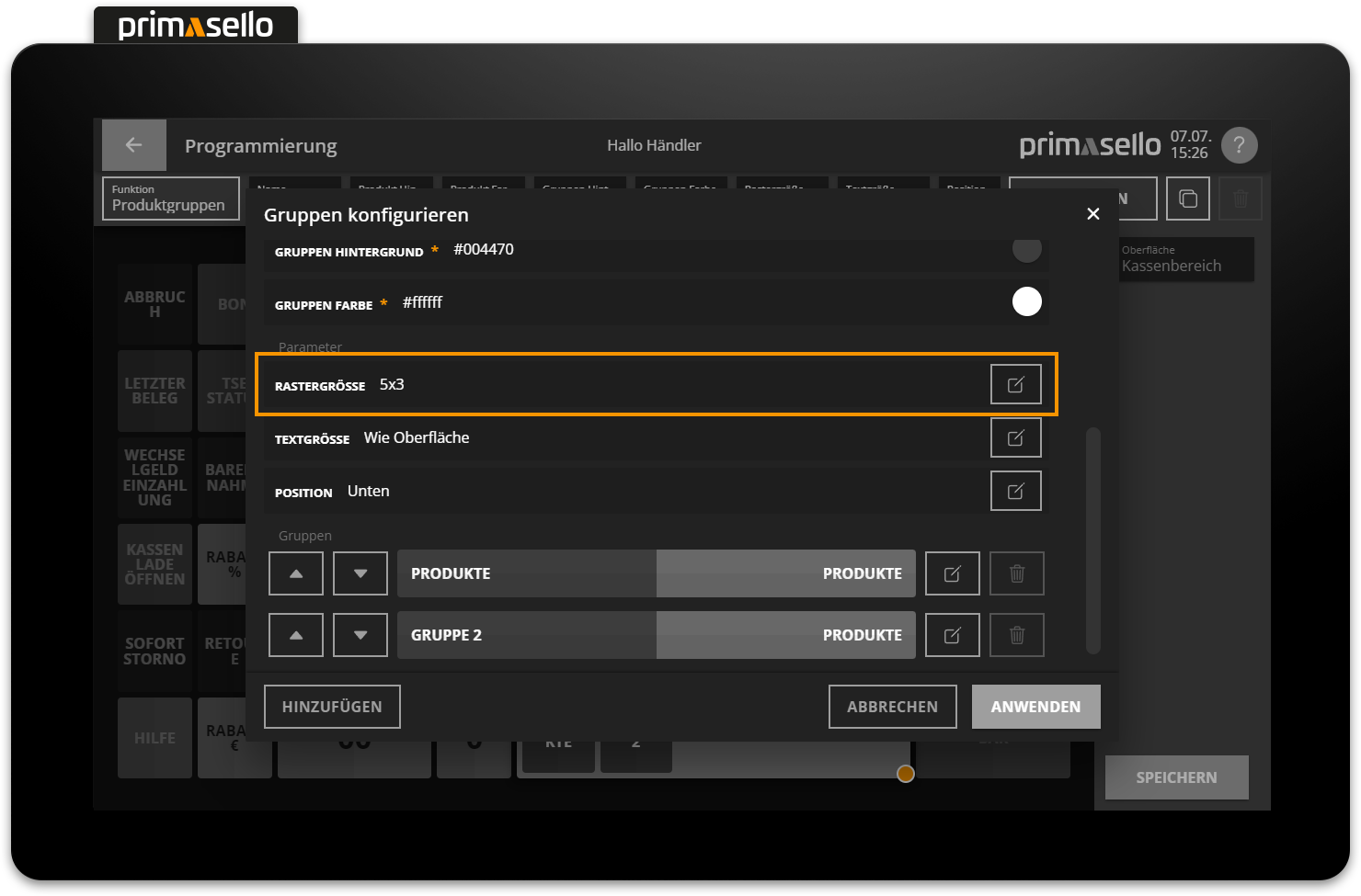
By clicking on the ‘Edit’ button, you can specify the desired number of columns and rows or reset the settings to ‘As surface’.
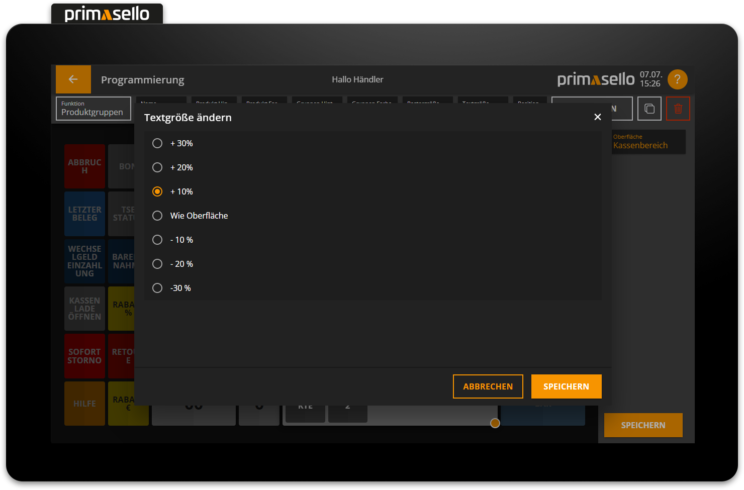
Text size
The text size of the buttons in the element can also be adjusted. It can be configured relative to the general text size of the interface.
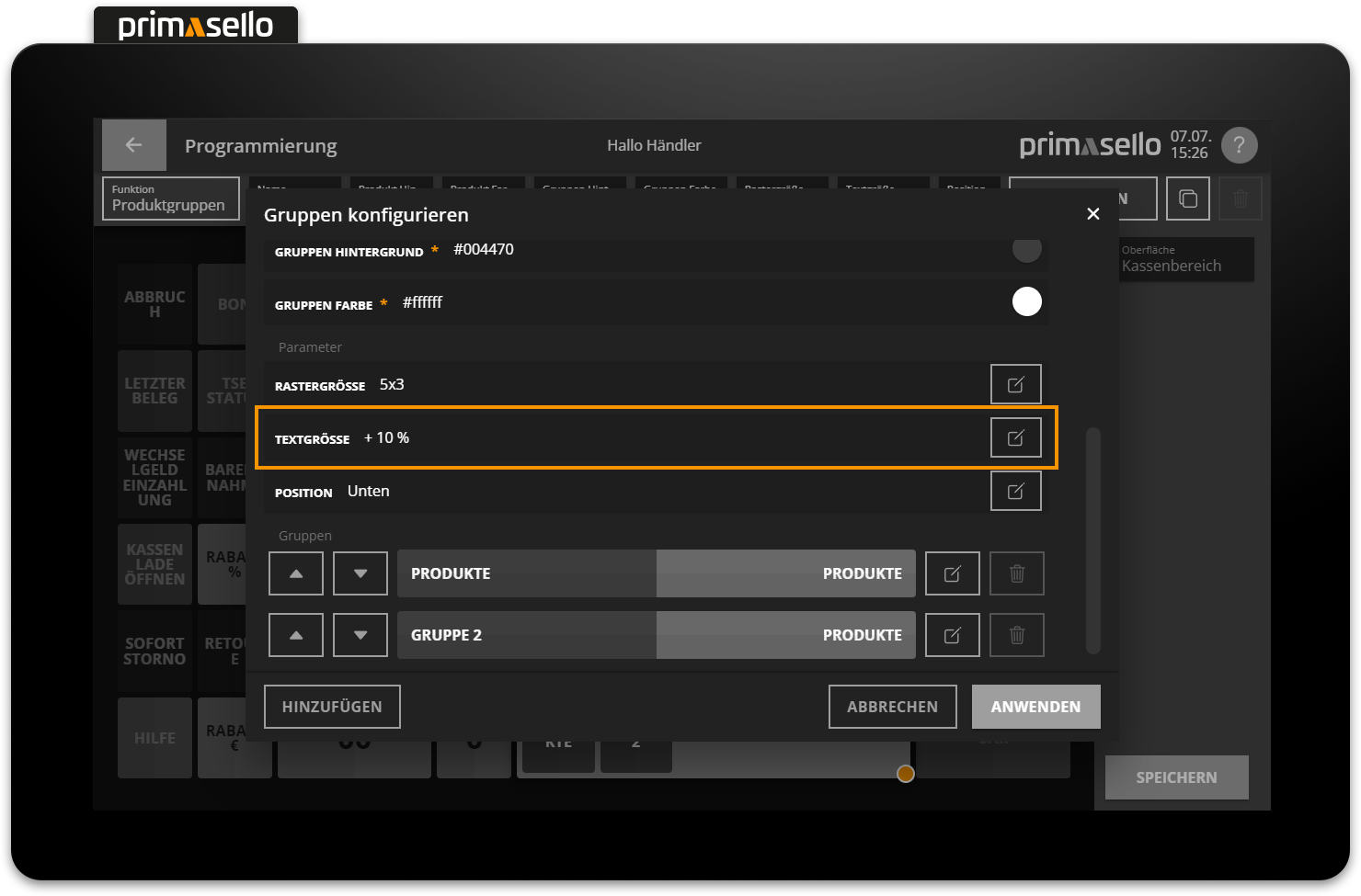
The options available are ‘Same as surface’ and 10/20/30% larger or smaller than the text size of the layout.
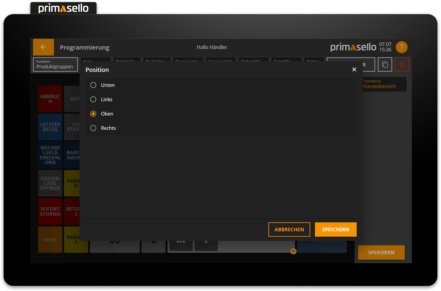
Position
The position of the product group selection within the element can also be defined.
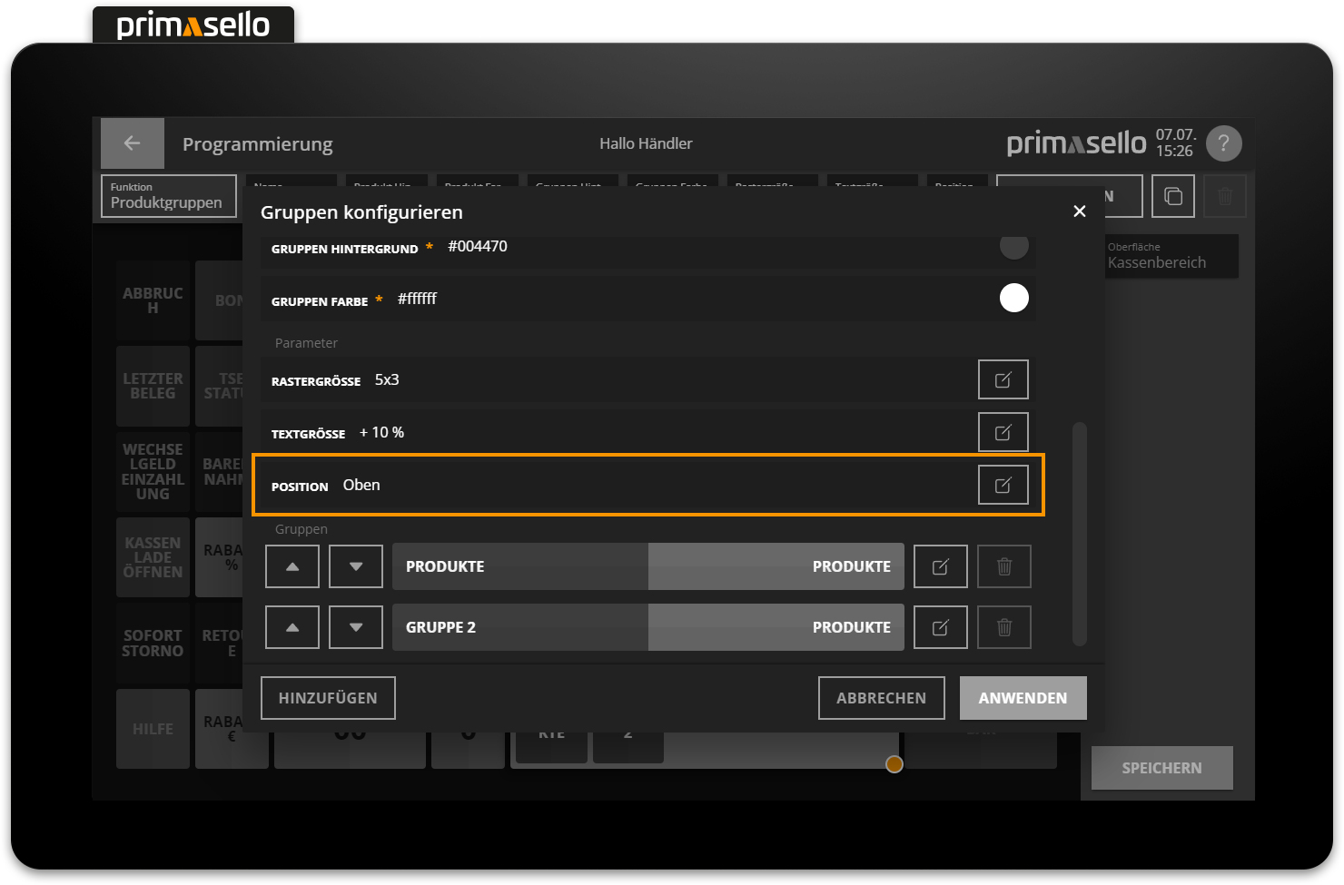
You can choose between bottom, left, top or right. The scroll function is automatically displayed on the opposite page.
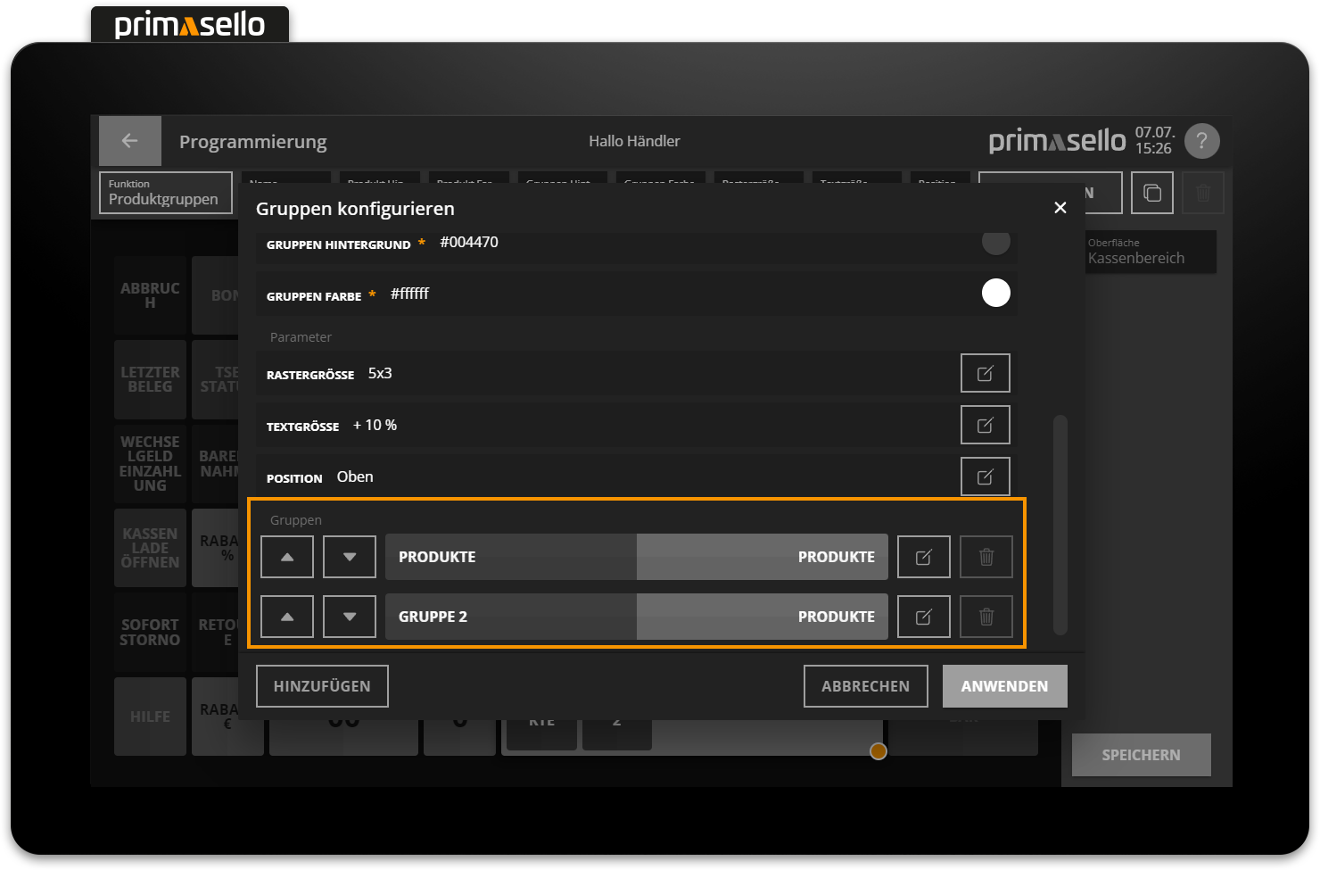
Groups
Under the ‘Groups’ item, you can configure the sorting and display of the groups to be shown. For each group, you can specify a separate group and product colour as well as the order. Groups can be removed or added again using the 'Add' button.
Products individually
Products can also be placed individually on the surface – similar to functions. To do this, click on a free field with the ‘+’ symbol to open the button menu.
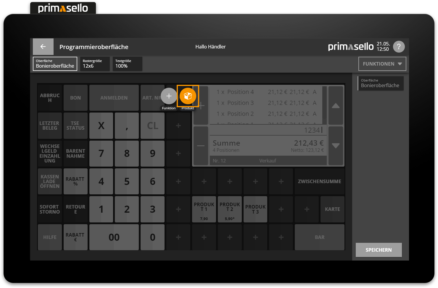
Selecting the ‘Product’ icon opens a window displaying the available product groups.
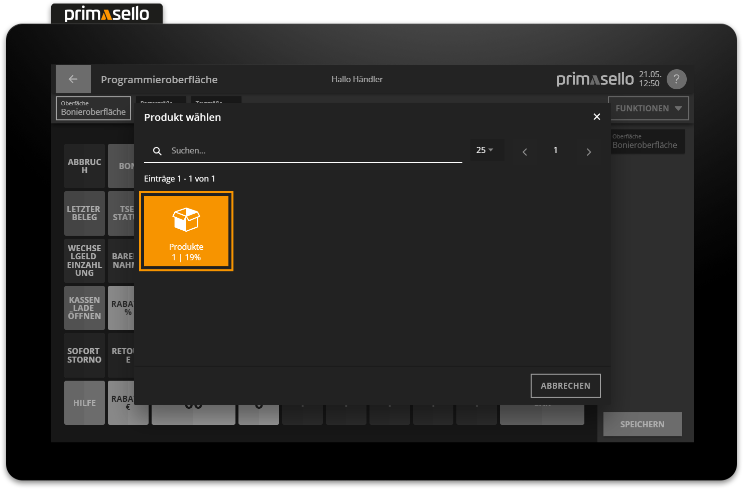
After selecting a group, a list of the products it contains appears. Clicking on the desired product places it on the selected field and closes the window.
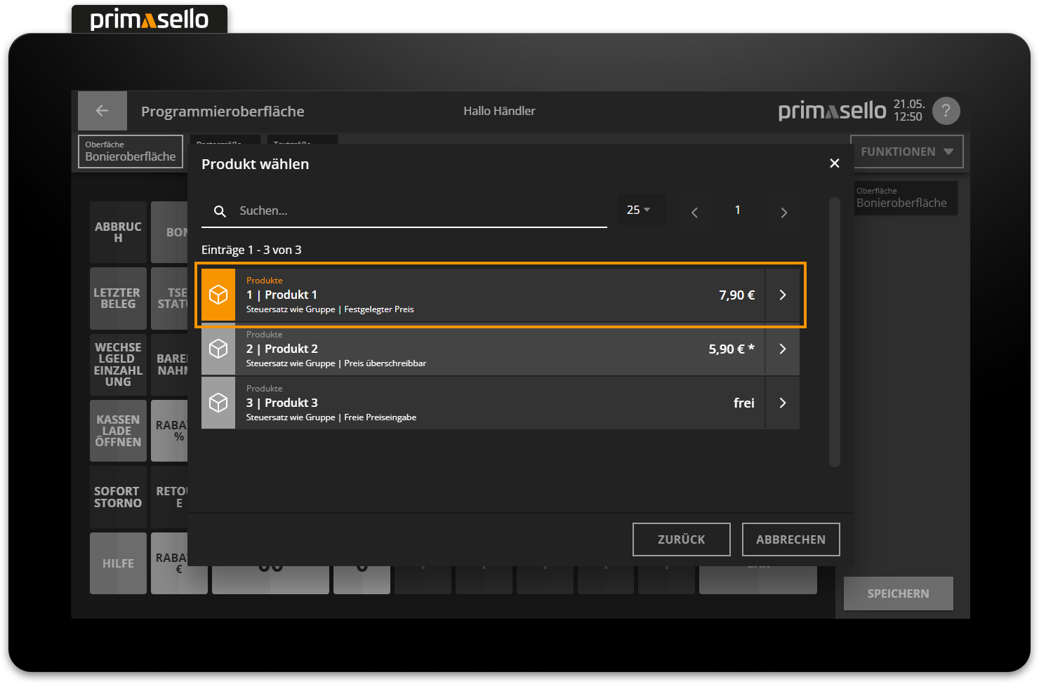
The added product button can be edited, moved, enlarged or deleted like any other function button. If another product is added, the last product group used will open automatically. To return to the overview of all groups, use the ‘Back’ button in the lower right corner. If the wrong product has been selected, it can be replaced using the ‘Product’ property field in the editing bar at the top of the screen. This will reopen the overview of all product groups so that a new product can be selected.
Deleted products
If a product is deleted from the master data, it will still remain on the register interface. When attempting to register this product, an error message will appear. In this case, the product has to be relinked in the programming interface or the corresponding button has to be removed.